BUILDING A SCALABLE DESIGN SYSTEM FOR WONDR: ENABLING CONSISTENCY ACROSS A GROWING HEALTHCARE PLATFORM
Years of fragmented experiences across Wondr's products revealed the need for a unified design system. Inconsistencies were slowing delivery, creating usability issues, and increasing maintenance overhead.
By defining a shared library of components, patterns, and principles, we improved consistency across the platform - allowing users to transfer familiarity between products and enhancing overall usability.
Internally, the system became a single source of truth for design and development teams. It streamlined collaboration, reduced duplication, and accelerated feature delivery by giving teams a solid foundation to build from.

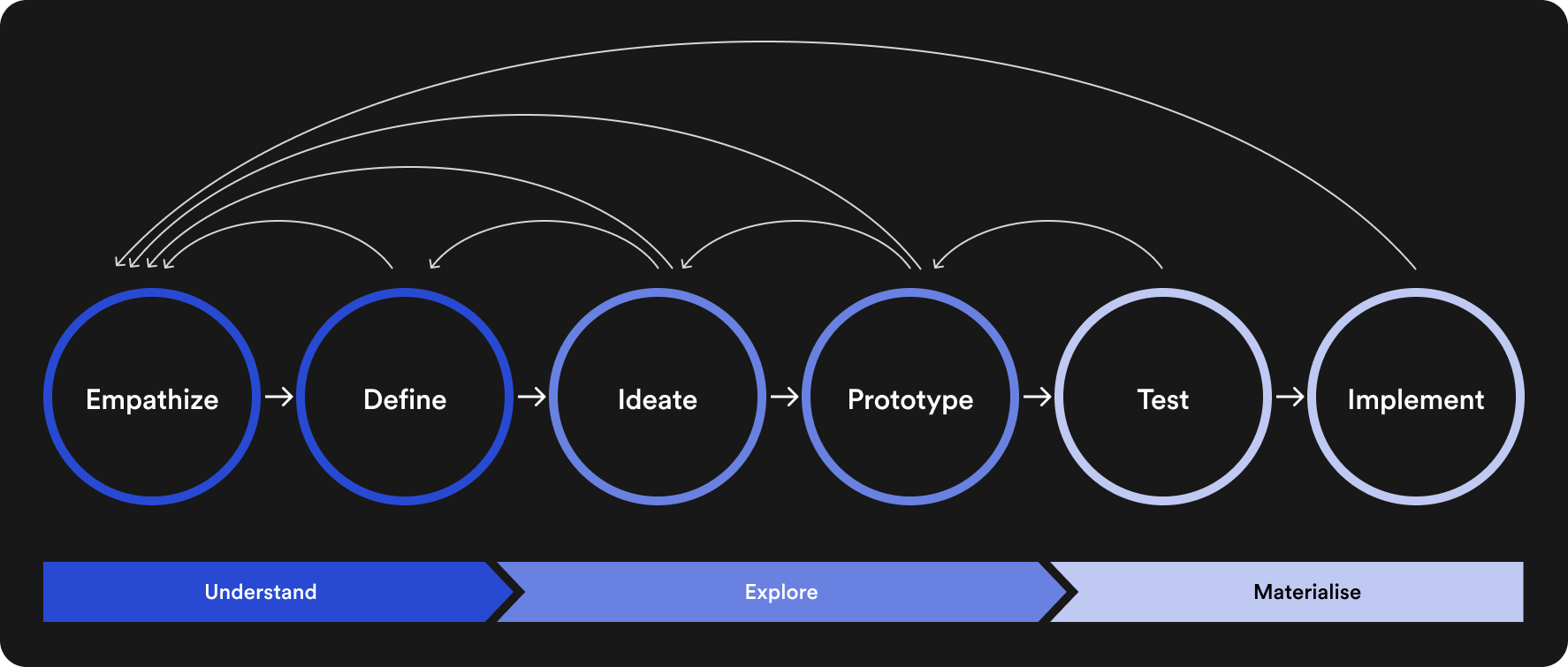
Unify the experience
Create a single language for UI components & interfaces

Accelerate Design
Enable faster, more consistent feature delivery

Improve Collaboration
Align design & engineering workflows

Ensure Accessibility
Embed AAA standards from the get-go

Reduce Maintenance
Minimise complexity & duplication through re-use

Support Scaling
Allow modular & flexible growth as Wondr scales
Wondr connects healthcare professionals across borders, so the design system needed to reflect the values at the heart of that mission.
Our guiding principles:
• Universal Usability - Interfaces must be intuitive regardless of role or region
• Trust & Credibility - Design choices must inspire confidence in critical environments
• Accessibility - Everyone should be able to engage, regardless of ability or setting
• Adaptability - Scalable patterns that flex across products, devices, and contexts
• Cohesiveness - A unified visual language to ensure consistency across touchpoints
These principles shaped every component, helping us create interfaces that feel familiar, dependable, and clear, while supporting seamless communication in high-stakes healthcare settings.
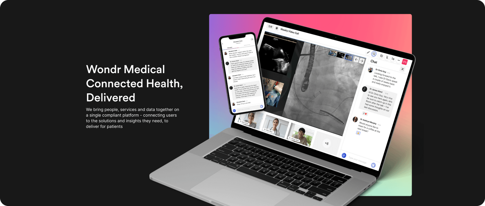
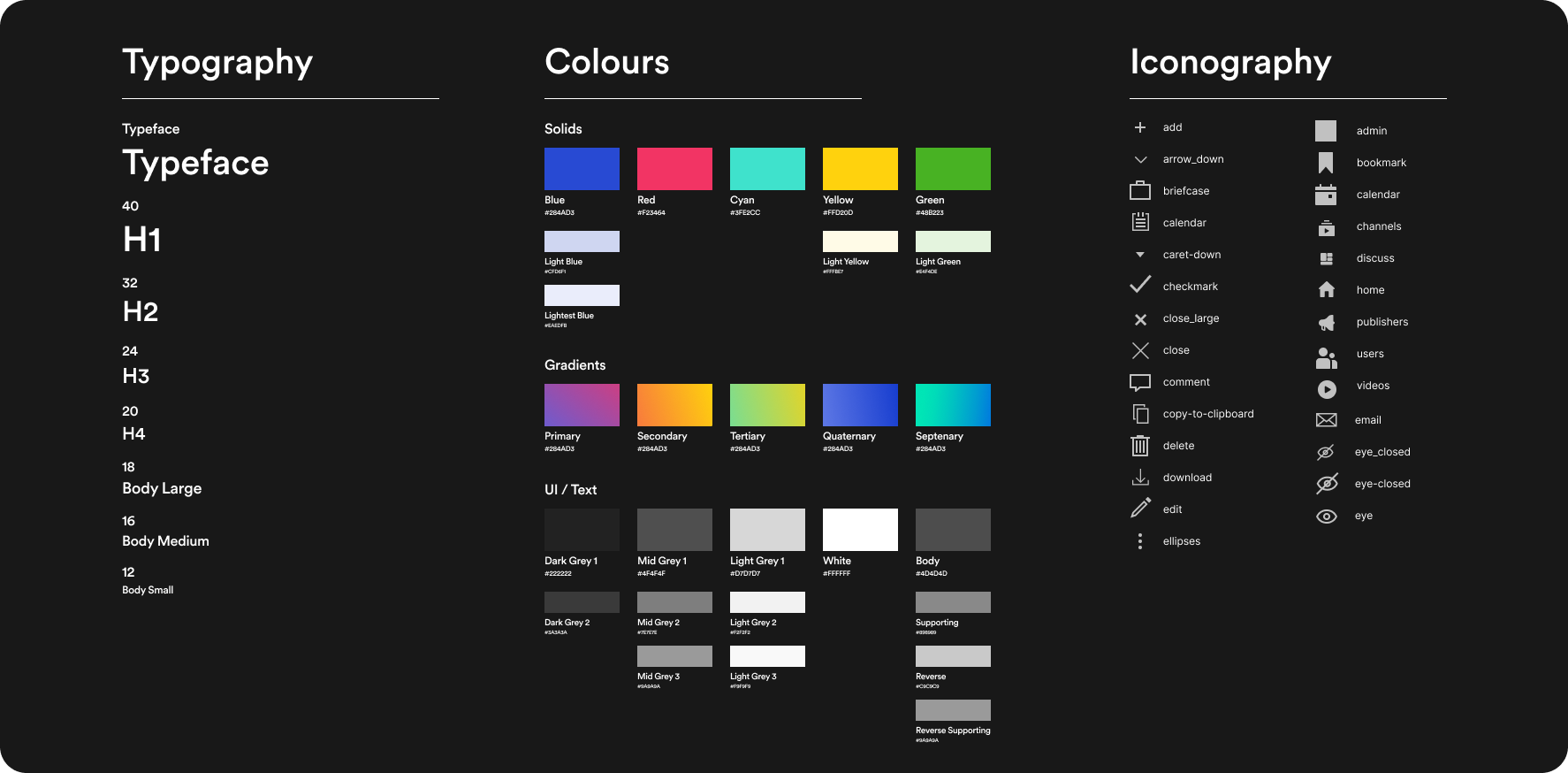
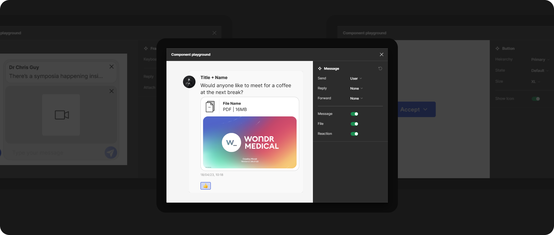
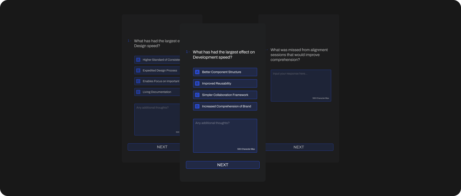
The W_ System defines a cohesive visual identity that gives all Wondr interfaces a clear, considered, and brand-aligned look.
This consistency enhances user trust and recognition, and reinforces our mission of seamless, meaningful connection in healthcare.
Beyond external impact, the visual system also improves internal workflows - By standardising layout, type, colour, and iconography, teams across design, engineering, and product can move faster, focusing less on recreating basic patterns and more on delivering high-impact features.
Driving adoption wasn't just about introducing a system - it was about embedding it into how teams worked.
We worked early with engineering & product to shape a system that solved real problems.
Once launched, we ran targeted workshops, published practical documentation, enabled inter-system connection (Storybook) and built clear contribution standards that encouraged ownership across teams.
By empowering internal advocates and streamlining integration into active workflows, the system reached over 80% re-use rate across live projects within months, and 4x adoption compared to our previous 'System' (If it could be called one...) - improving cross-team collaboration and accelerating product delivery.
Ongoing feedback was essential to ensure the system evolved with the product and remained useful across teams.
We created structured feedback loops through regular check-ins with design, product, and engineering.
These sessions helped us identify edge cases, friction points and unmet needs early, before they became blockers.
We led over 20 feedback sessions post deployment, resulting in 15+ component updates and refinements to usage guidance to ensure an effective evolution of our platform as a whole
The Wondr Design System streamlined delivery, reduced design debt, and drove consistency across all products.
With 80%+ re-use rate in active projects, it enabled faster feature rollout, improved team efficiency, and elevated the overall user experience.
As Wondr scales, the system continues to deliver measurable value across design, development, and product execution.


