EMPOWERING HEALTHCARE PROFESSIONALS TO CONNECT, SHARE KNOWLEDGE, AND COORDINATE CARE WORLDWIDE

Led Design: Defined and executed core UX patterns across key collaboration tools: chat, video, and profiles

Ongoing Timeframe: From early research through to pilot implementation with continued design guidance

Strategic Significance: Positioned Wondr to become a trusted platform in the global medical collaboration space

Multi-faceted Challenge: Designed for both individual healthcare professionals and institutional medical teams

Comprehensive UX Process: Conducted in-depth user research, prototyped features, and ensured medical compliance in design

Measurable ROI: Enabled knowledge-sharing and coordination in life-critical contexts, where design clarity directly affects outcomes
In an increasingly interconnected medical landscape, healthcare professionals lacked a secure, unified space to collaborate across borders and disciplines. Fragmented communication tools, regulatory challenges, and inconsistent UX patterns created barriers to interdisciplinary exchange - particularly in remote, high-stakes, or academic environments.

Medical professionals lacked a secure, purpose-built space to collaborate across borders:
Wondr had the chance to unify chat, video, and verified profiles into one platform:

Led UX Strategy
Across core features on web and mobile

Drove Discovery
Workshops and research with medical users

Designed Features
Chat, video, and profiles end-to-end

Built Design Systems
Scalable, consistent UI components

Advocated for Users
Kept clinical needs at the center of solutions
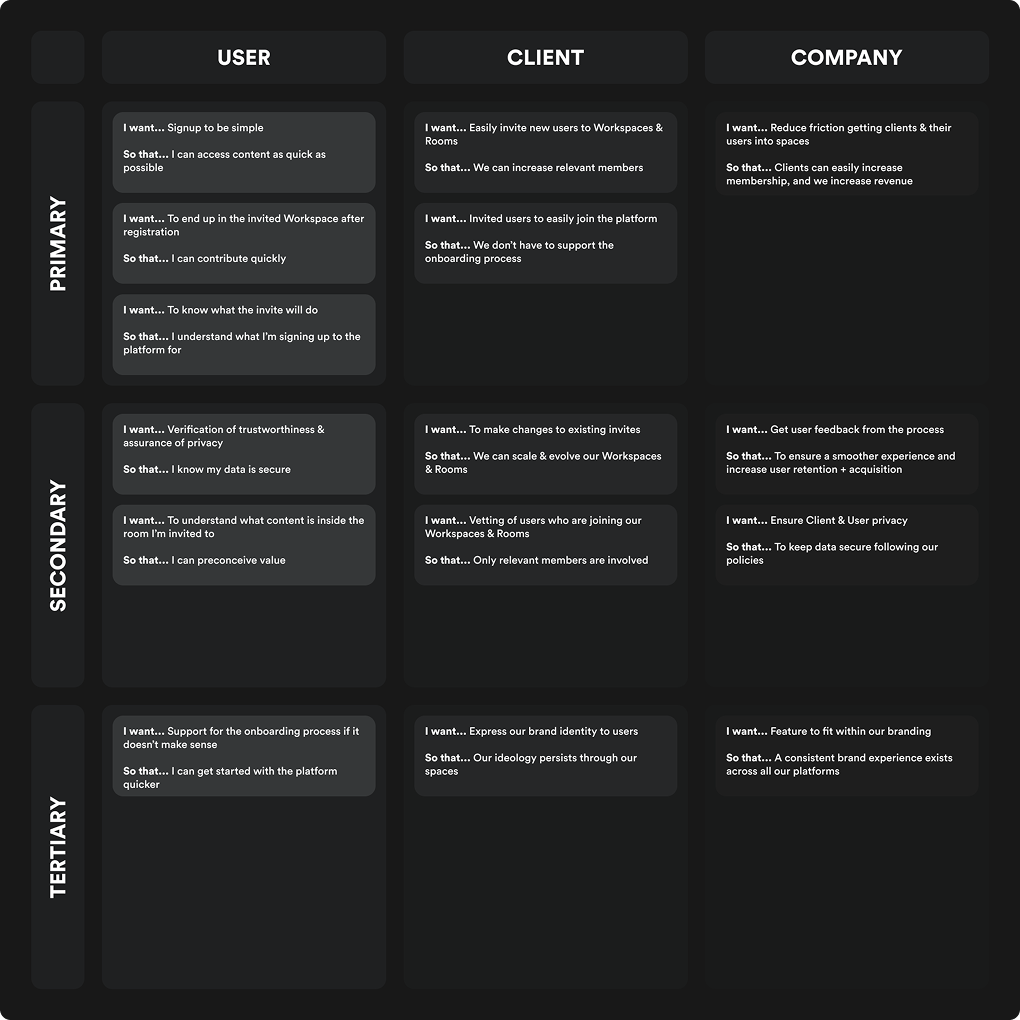
We began by aligning stakeholder priorities across users, clients, and the business. Collaborative discovery sessions helped us define critical requirements, from secure communication to scalable user management. This foundation ensured we delivered value across the board:
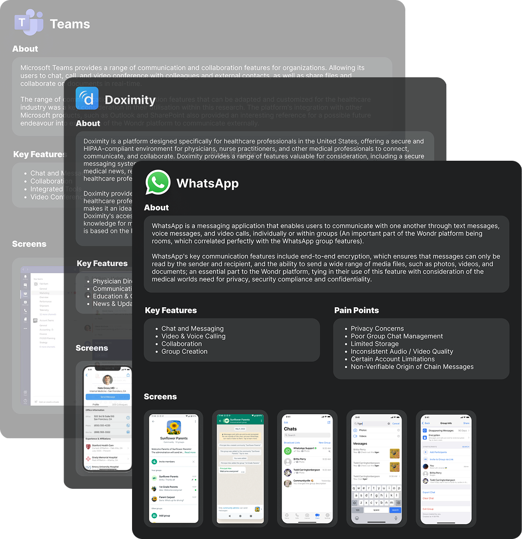
With few direct competitors, we broadened our research to adjacent platforms like Microsoft Teams, Doximity, and Sermo. This revealed critical UX patterns, gaps in clinician communication tools, and opportunities for Wondr to differentiate.
Insights from both enterprise and medical platforms informed the creation of Wondr Video - a unique, revenue-generating feature - and helped us define the core affordances expected in trusted communication tools.
Note: Shown here is a condensed version of our broader analysis.
In a complex healthcare environment, it was essential to align the needs of users, clients, and the business. Through collaborative workshops with the product team, we identified key requirements to fulfil Wondr's vision of a truly interconnected medical platform.
This alignment ensured we designed a product that was intuitive, valuable to clinicians, and strategically sound, supporting growth to over 70,000 users, including 10,000+ active professionals.
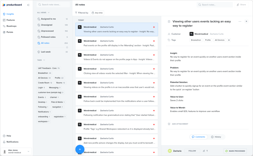
We combined analytics and user testing to uncover friction points, validate improvements, and refine high-impact areas like onboarding and event chatrooms. This data-led approach helped us deliver a smoother user experience and stronger client outcomes.
CREATING INTUITIVE & CONSISTENT INTERFACES THAT SUPPORT COLLABORATION IN CLINICAL ENVIRONMENTS
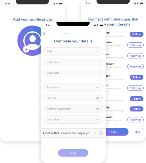
Balancing between simplicity and collecting essential data was an important process, and through addressing and identifying various pain points we were able to reduce friction in the conversion process.
Healthcare professionals shouldn't have to waste time going through a tedious onboarding process - Only the questions that we need to get them set up to maximise initial usage of the platform are asked; Otherwise, we skip it.
BEFORE
(MOBILE)

AFTER
(MOBILE)


AFTER
(DESKTOP)
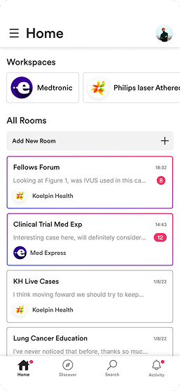
Navigating the cluttered and visually similar content on the home page lacked immediate direction for the user, and with limited affordance designed there was no existing mental model to follow.
Simplicity through understanding core tasks and priorities enabled us to direct users where they wanted, and needed to be to utilise the platform. Not only did this serve our users comprehension, but our eased our clients frustrations in failure to easily get users into Rooms.
BEFORE
(MOBILE)
AFTER
(MOBILE)

AFTER
(DESKTOP)
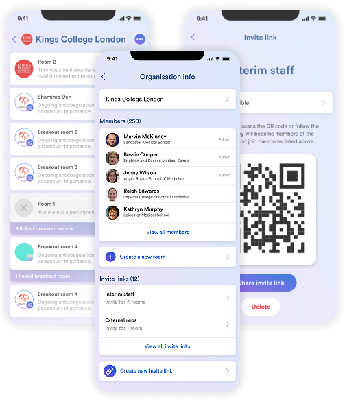
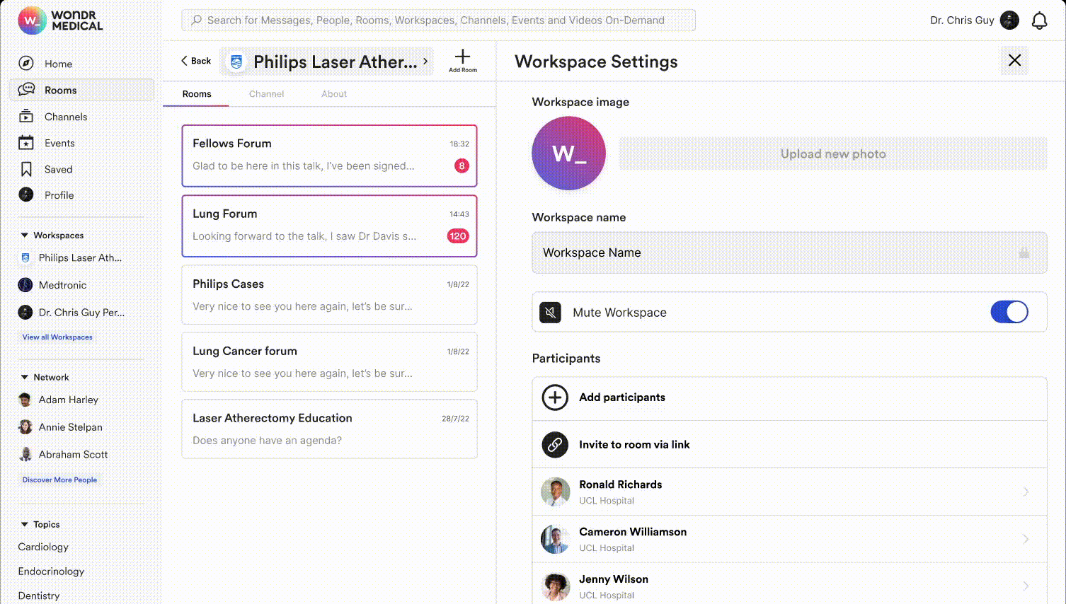
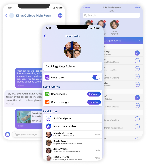
Significant pain points existing around inviting, onboarding and managing users, resulting in frustration for clients who wanted to effortlessly build their workspaces with the relevant users. Smoothing out key workspace interactions empowered clients to focus on collaboration
Research uncovered many valuable points such as confusing management and limited intuitive action; Through iterative prototypes and consistent research we consolidated inconsistent patterns and removed distractions.
BEFORE
(MOBILE)
AFTER
(MOBILE)

AFTER 2
(MOBILE)

AFTER
(DESKTOP)
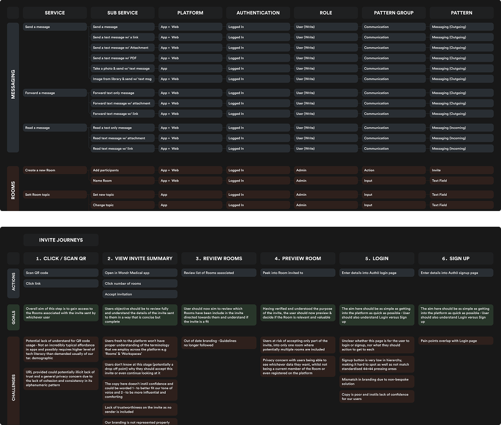
Fragmented invite processes obstructed a key goal for our clients, building their teams. Understanding user journeys, and exposing inconsistencies through service blueprinting we were able to reveal key frustrations.
Through refinement, we focused on unifying a simple, streamlined and well branded experience.
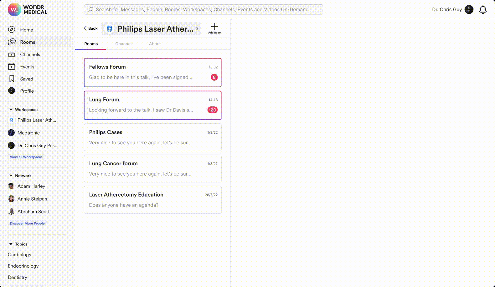
AFTER
(MOBILE)
AFTER
(DESKTOP)

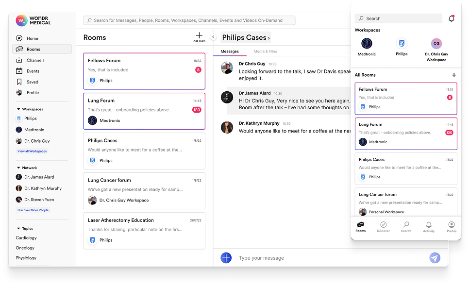
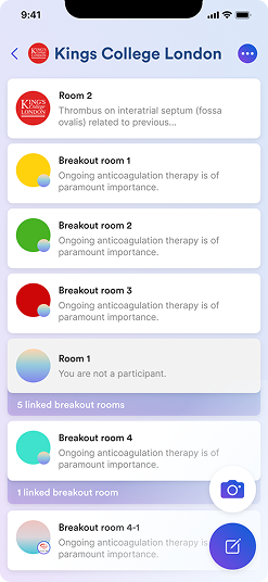
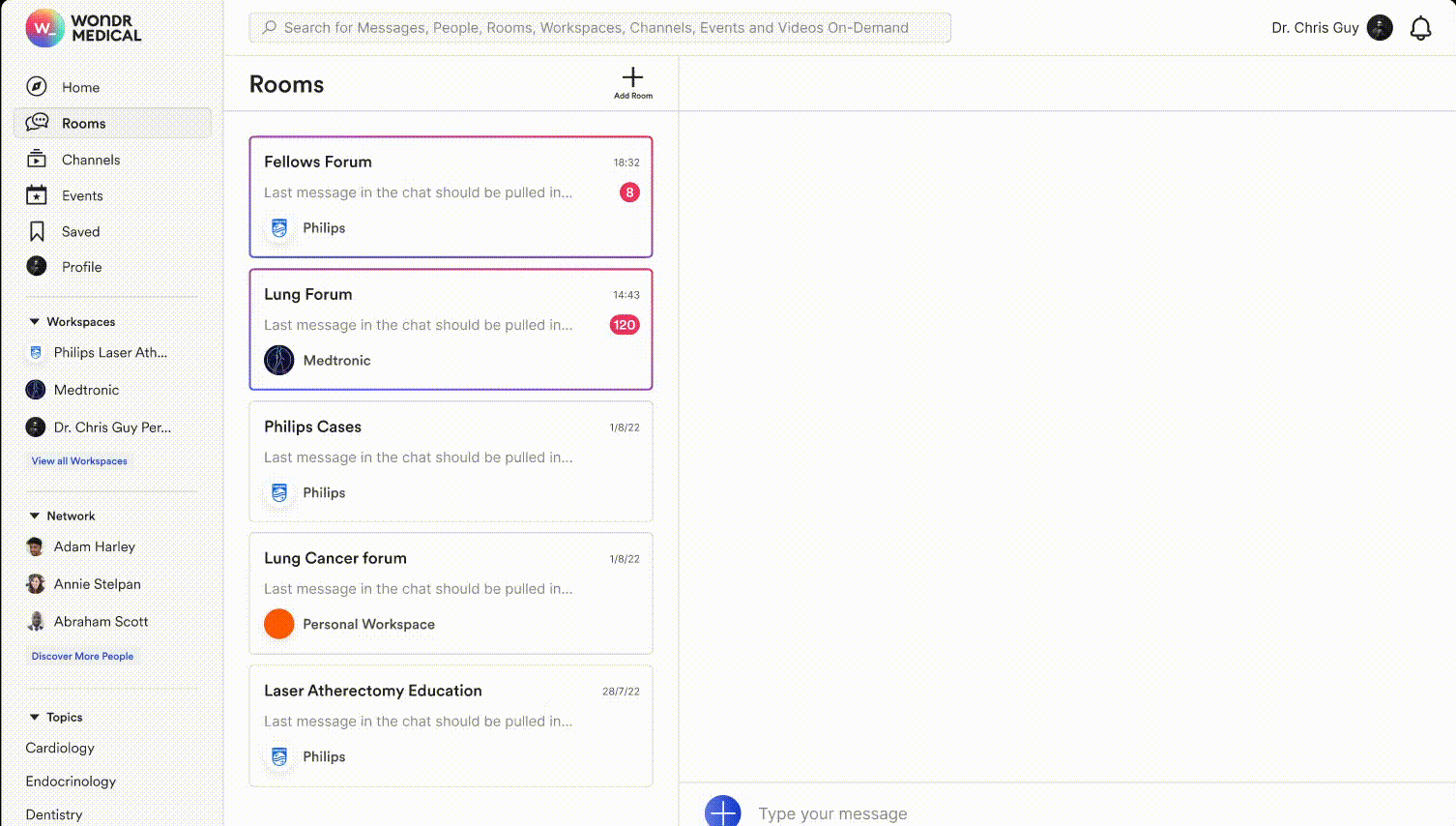
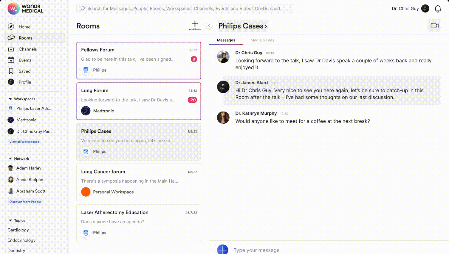
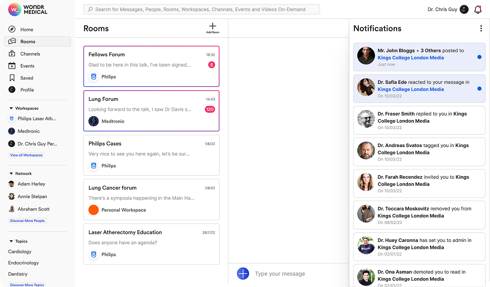
Improving the Rooms section was crucial as this area enabled core collaboration on the platform. It was clear that several areas needed consolidation and improvement through pattern alignment, unified journeys and removal of unnecessary steps. By achieving this, we established a solid foundation for future improvements to Rooms.
Inconsistencies and disjointed patterns made navigation and comprehension difficult when accessing a central part of the platform, creating clear friction. Through clarity and stripping unnecessary, confusing elements, users could focus on creating collaborative spaces.
BEFORE
(MOBILE)
AFTER
(MOBILE)
AFTER
(DESKTOP)
Users struggled to access essential files in the experience, with interviews revealing existing designs did not support discoverability or usability.
Transforming this area into a unified browsing experience was a sequential one, aiming to create a central hub for document visibility.
AFTER
(MOBILE)
AFTER
(DESKTOP)
Room controls didn't inspire confidence in users, and were very unintuitive - Errors were frequent, and there was limited freedom to manage rooms effectively.
By employing deeper, more intuitive controls, users felt in control of their own spaces.
AFTER
(MOBILE)
AFTER
(DESKTOP)
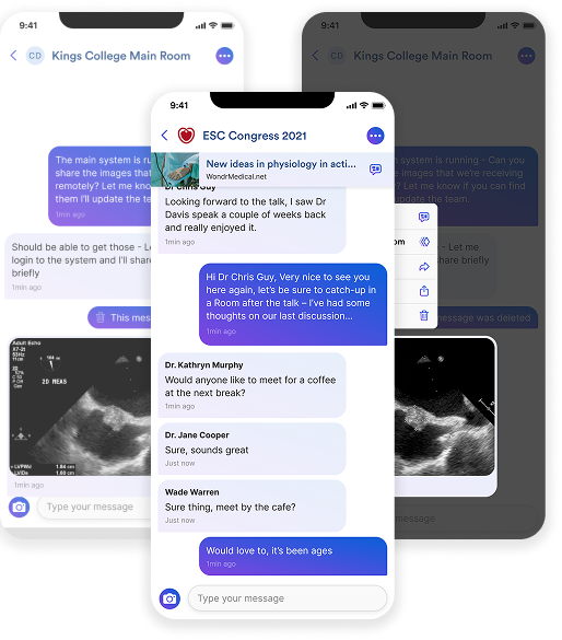
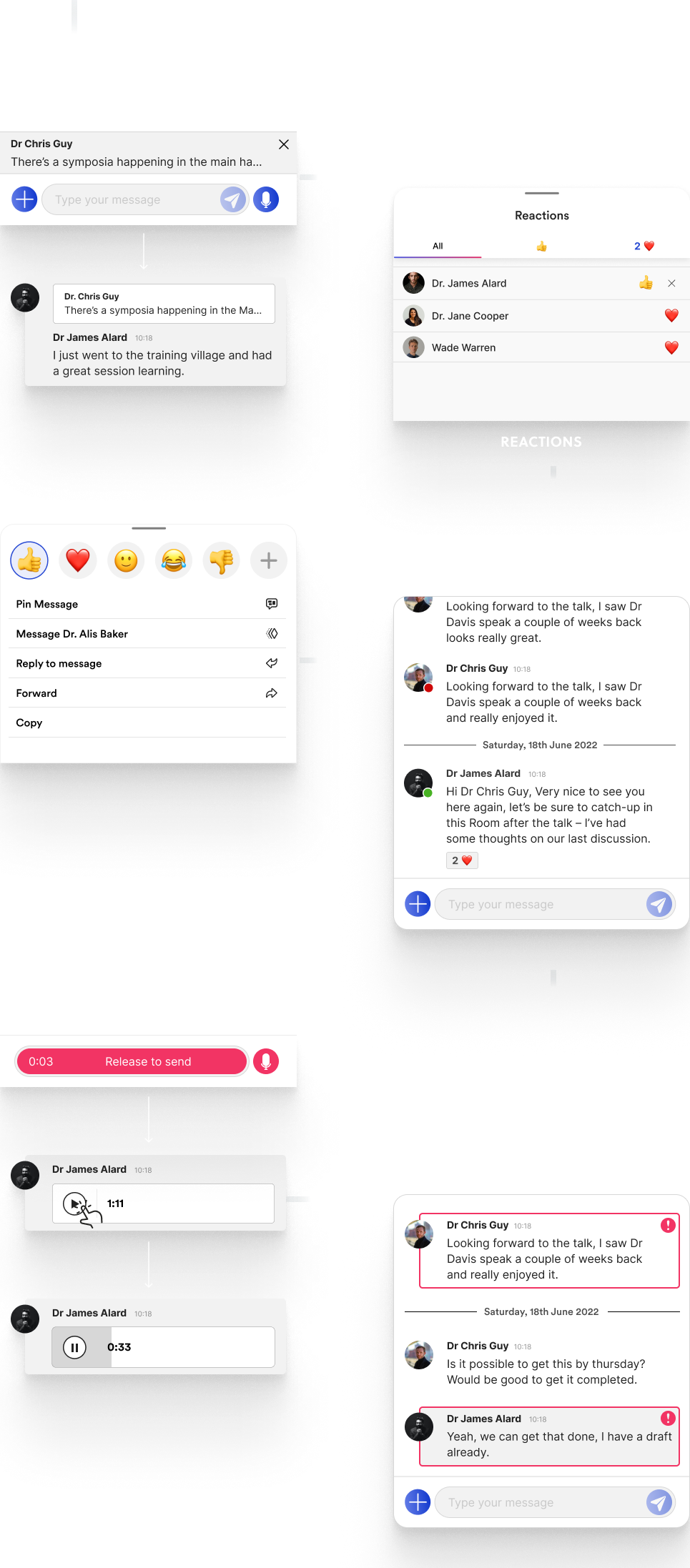
User interviews and research sessions revealed the same insights several time, that users wanted messaging capabilities that competed with their popular platforms - Otherwise why switch? Through sessions to understand what was key in their asks, we produced several changes to the messaging platform.
Enhance group communication with easy message replies - Boost engagement with visibility on message reactions, enabling users to gauge feedback foster interactive discussions - Effortlessly take action with new message options menu - Track user availability to help foster real-time interactions - Facilitate efficient communication with voice notes - Ensure urgent message delivery with high priority messaging
BEFORE
IMPROVED FILE DISCOVERY
NOTIFICATIONS
Through strategic UX design and continuous iteration, we delivered a platform that helped Wondr scale while improving engagement, retention, and feature adoption.
By streamlining key workflows and aligning the experience with real-world clinical needs, the product not only met user expectations but also supported client growth and positioned Wondr competitively within the digital health market.