STRONGfit 2.0

REDESIGN

TYPE
MOBILE APP
YEAR
2023
ROLE
UX LEAD
HOME
>
STRONGfit 2.0
Looking back on the STRONGfit app 2 years later, it's clear that while we set out with good intentions to meet the needs of fitness enthusiasts, there are areas where we fell short in fully understanding our users' goals and pain points. Our initial vision was to build an all-in-one fitness app, but feedback over the past year indicates we spread ourselves too thin across too many features instead of focusing on our core competencies.

By focusing more narrowly on our users' needs for motivation, accountability and social connection around their fitness journeys, STRONGfit 2.0 could really help enthusiasts take their health and performance to the next level. Our goal for the future isn't to be everything to everyone, but to be an indispensable resource for our core audience.

WORKOUTS MADE EVEN BETTER

ONBOARDING

HOME PAGE

PERSONAL BESTS

PROFILE

VIEWING WORKOUTS

CREATING WORKOUTS

WORKOUT ROUTINE

WORKOUTS 
MADE EVEN BETTER

TAKE ME TO THE ORIGINAL RESEARCH & DESIGN
With a more structured, user-centric design process, STRONGfit 2.0 aims to really fulfill our vision as an inclusive platform that meets all levels of fitness needs. This redesign proces has reiterated the importance of truly understanding your core users when bringing a product to market.

ONBOARDING

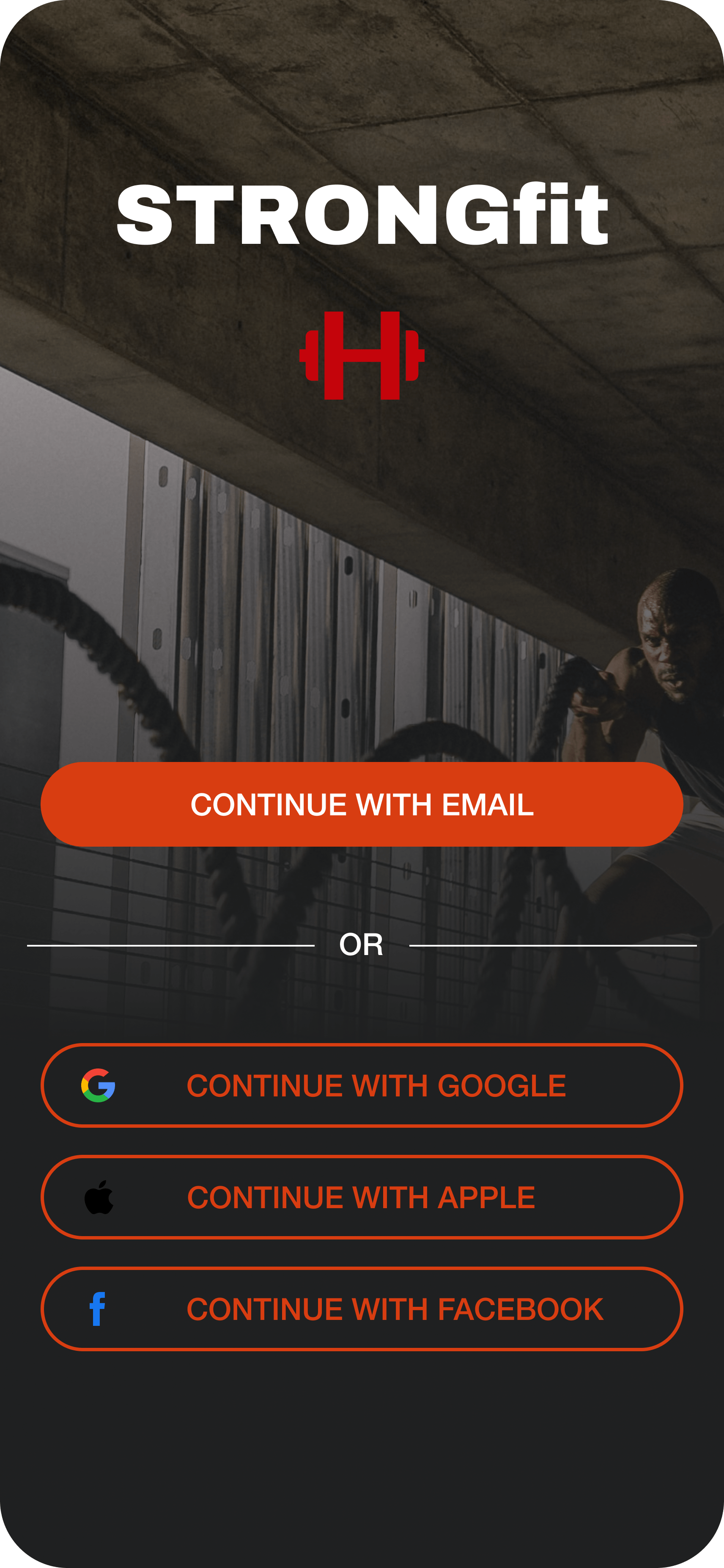
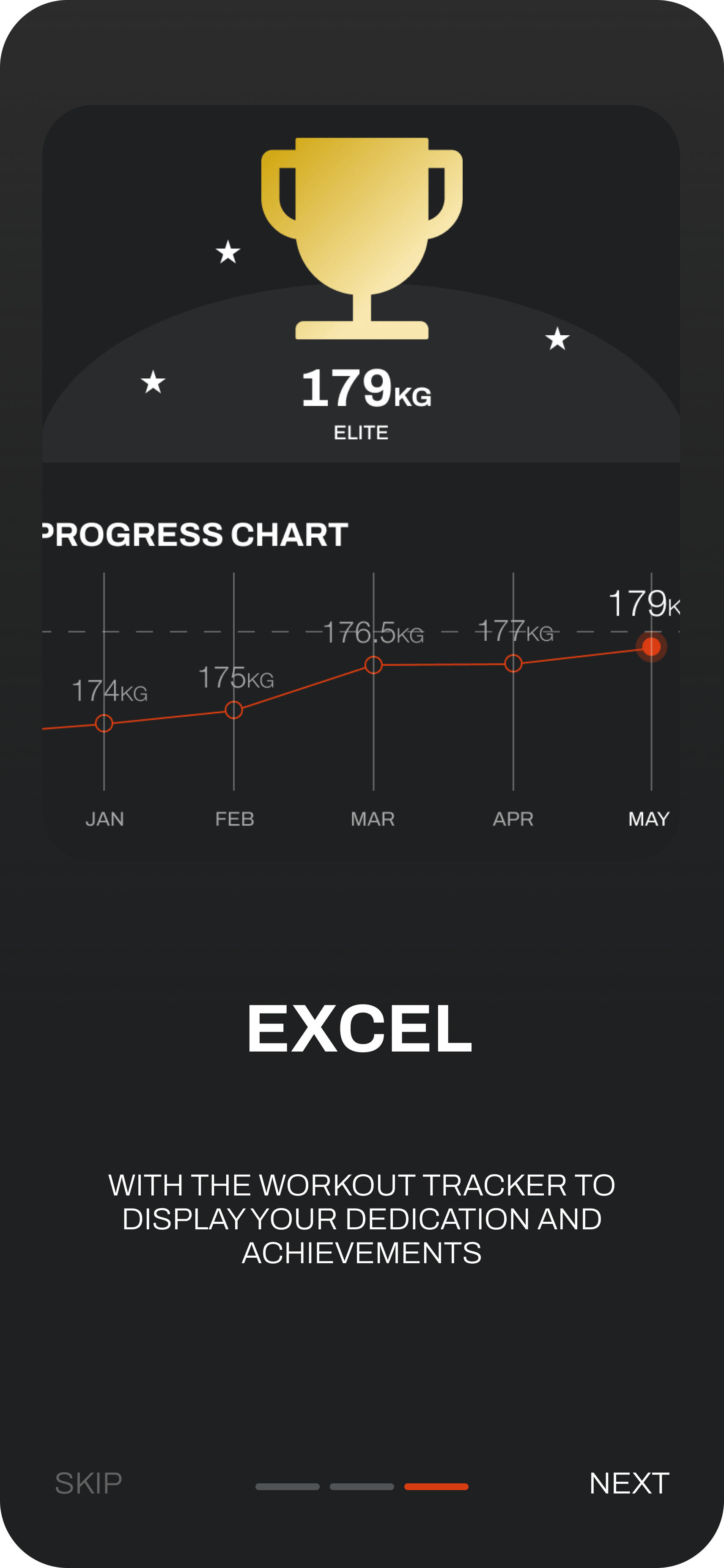
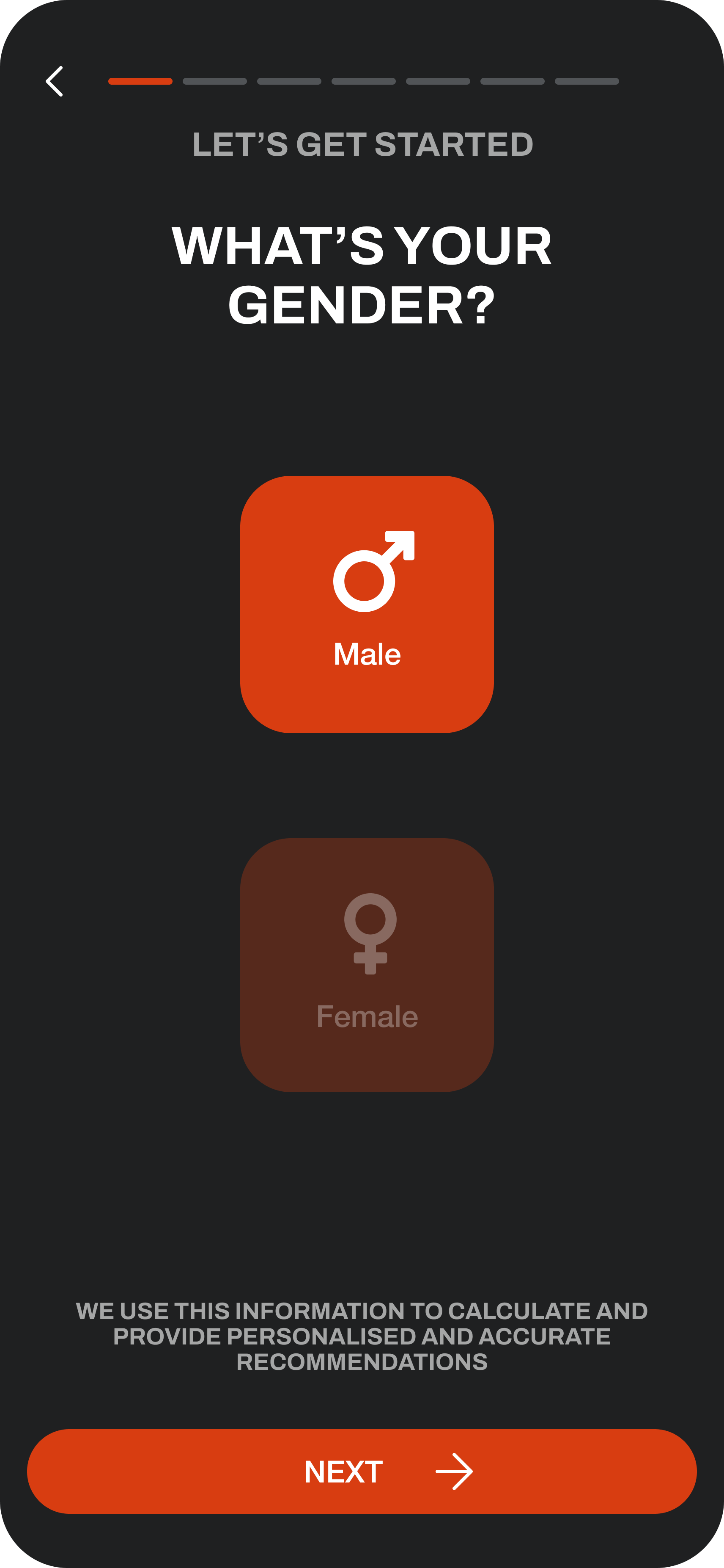
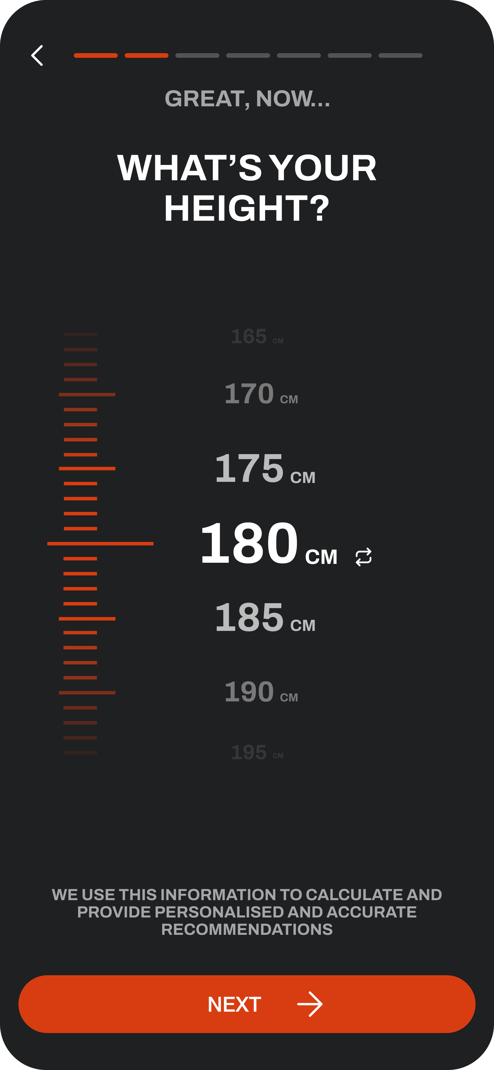
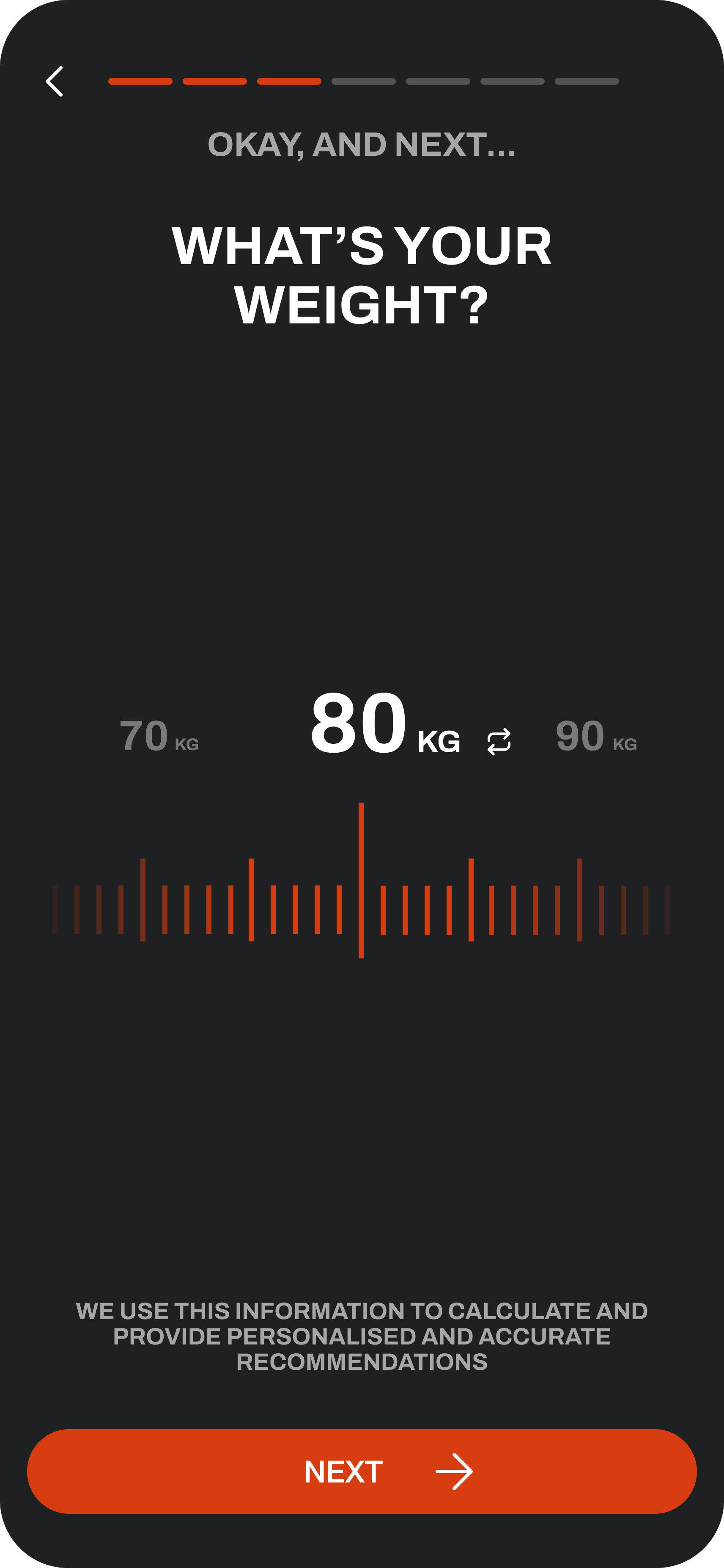
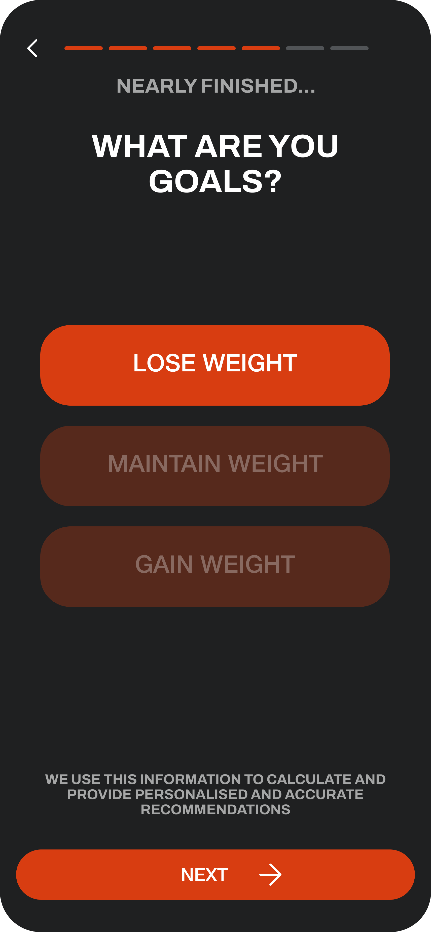
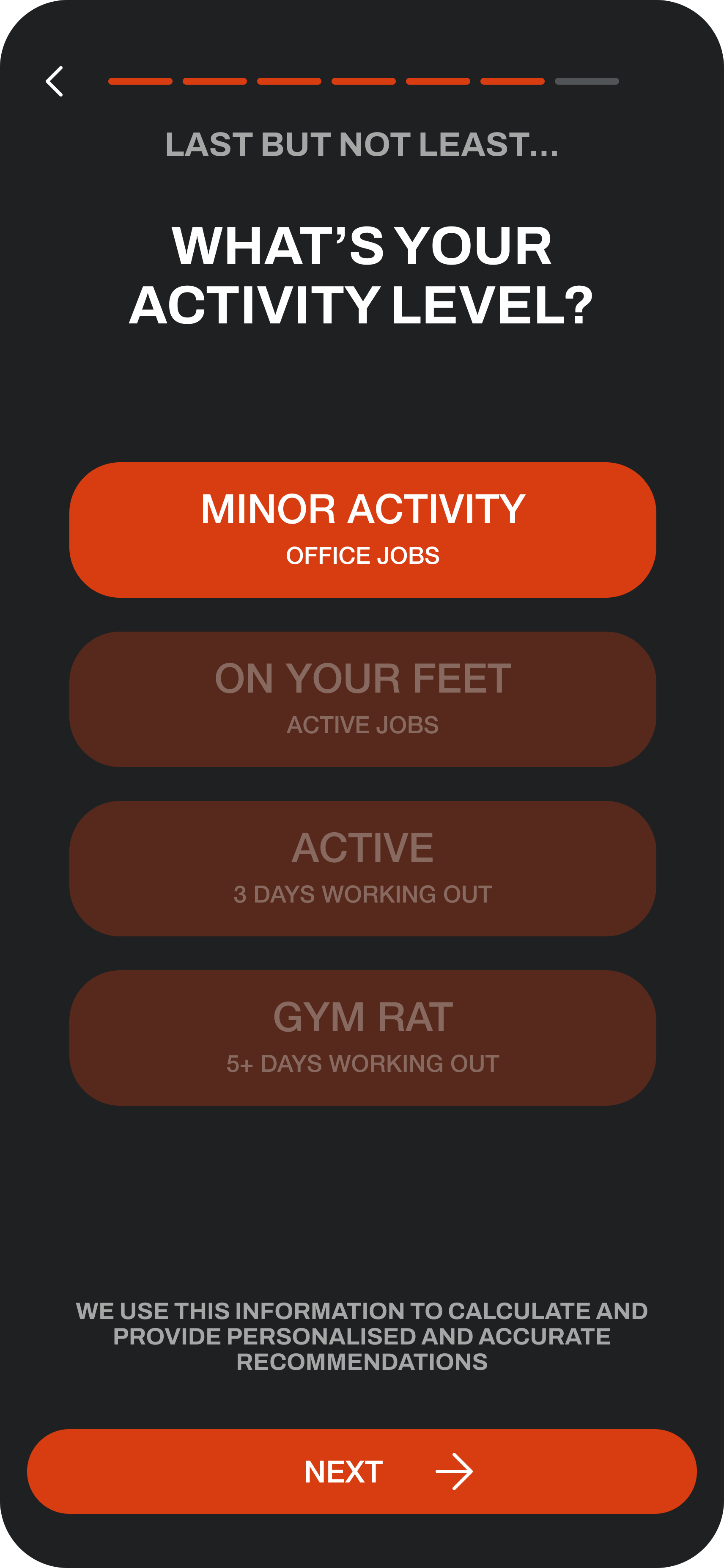
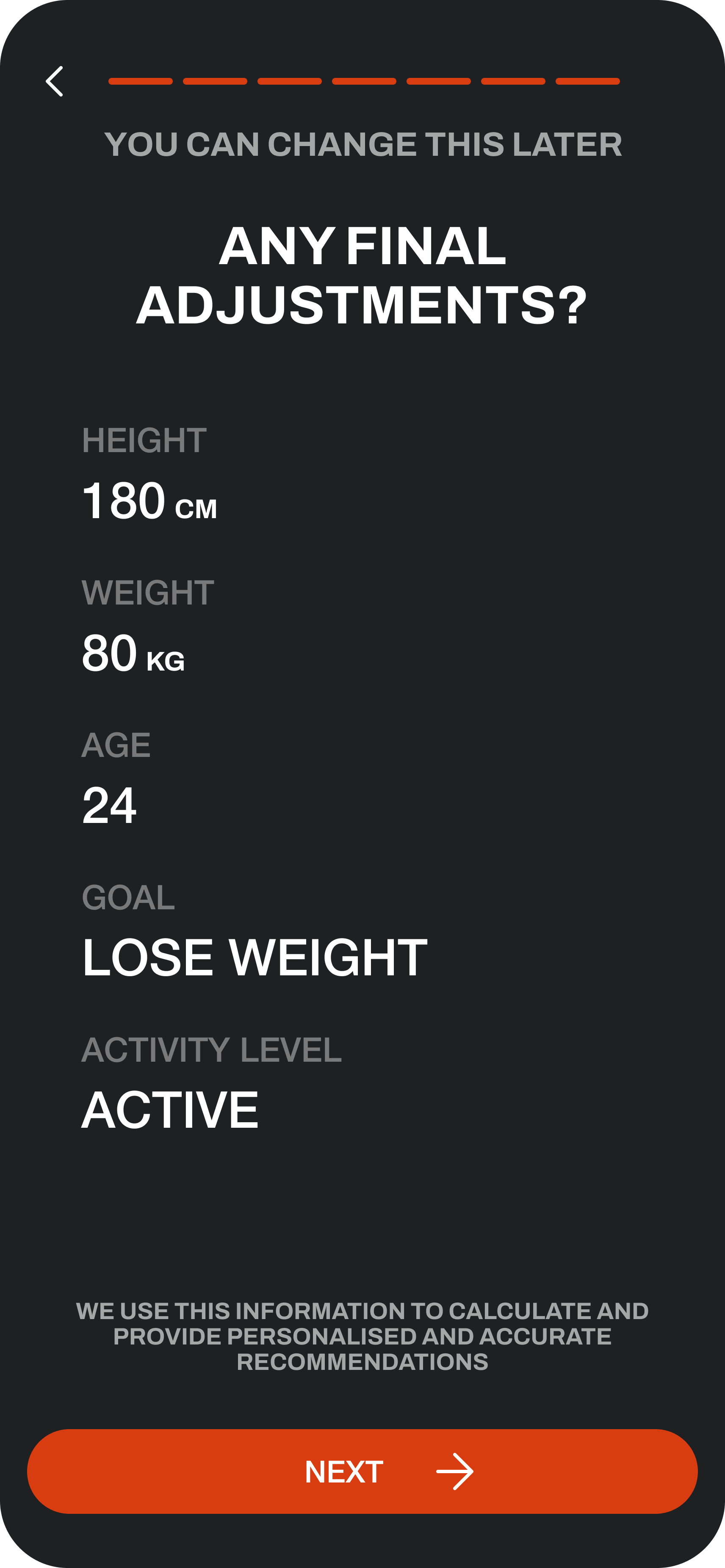
Registration would be the first touchpoint for future user’s, so it was important to keep the process simple and streamlined. It took several iterations of user research to understand where in the process was causing friction, which enabled us to trim the process down to how it exists today, focused on asking for only the important information.

• Simplified call-to-action buttons to reduce cognitive load by separating email and social media pathways.
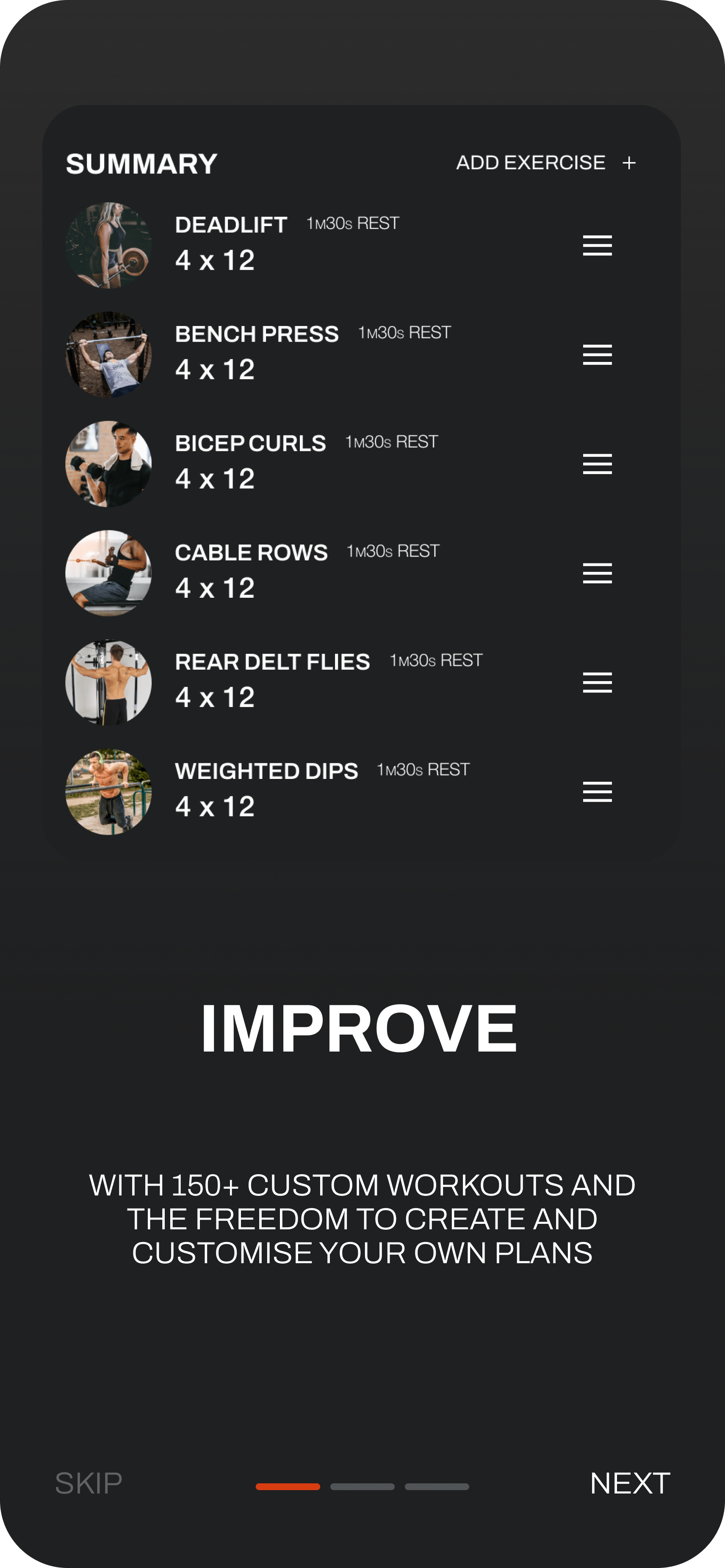
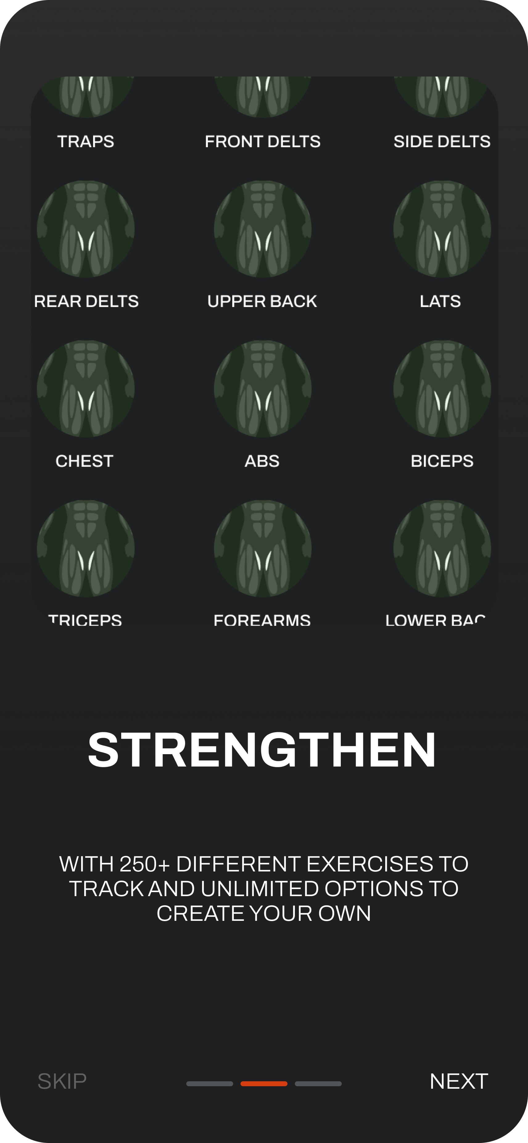
• Value proposition revised to set expectations by highlighting upcoming features before onboarding.
• Changes to page hierarchy and options prevented users skipping the process.
• Language tone optimised for the primary athletic male demographic.
• A progress step counter added to improve process clarity.
• Backwards navigation deprioritised to encourage onboarding completion.
• Explanatory text added to build user trust through transparency around data usage.
• Metric toggle relocated adjacent to the units for clearer understanding.
• Age question rephrased for enhanced data quality.
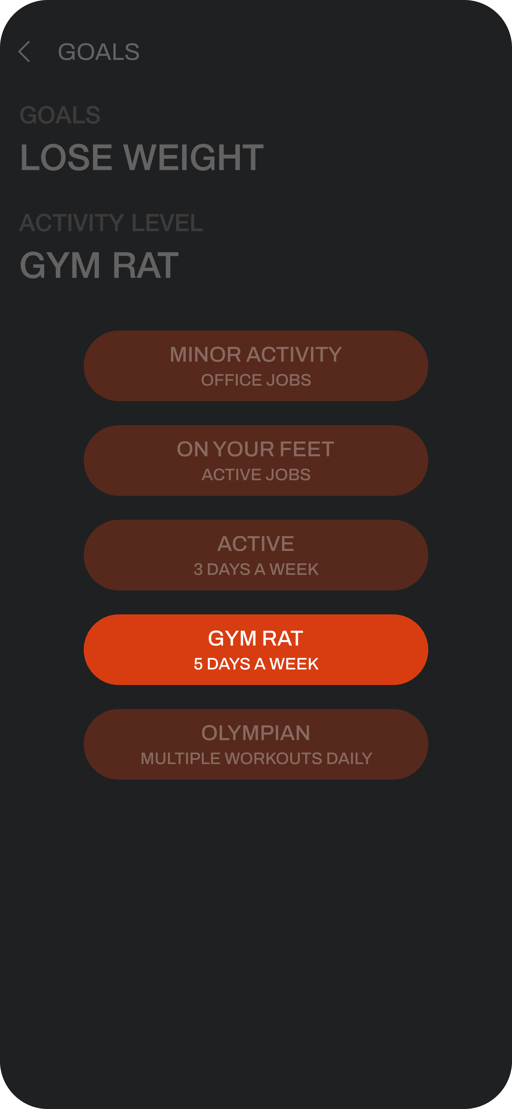
• Activity level positioning optimised based on user expectations.
• Activity options tailored based on usage data to focus on high-impact options.

Refinements to the signup user experience implemented resulted in improved comprehension, completion rates, and overall satisfaction for the target demographic.

For the future it would be valuable to understand the initial impact value proposition has, and if it leads to an increase in onboarding completion - Otherwise, it could potential be an additional 3 steps to the onboarding process, failing to align with miller’s law

HOME PAGE

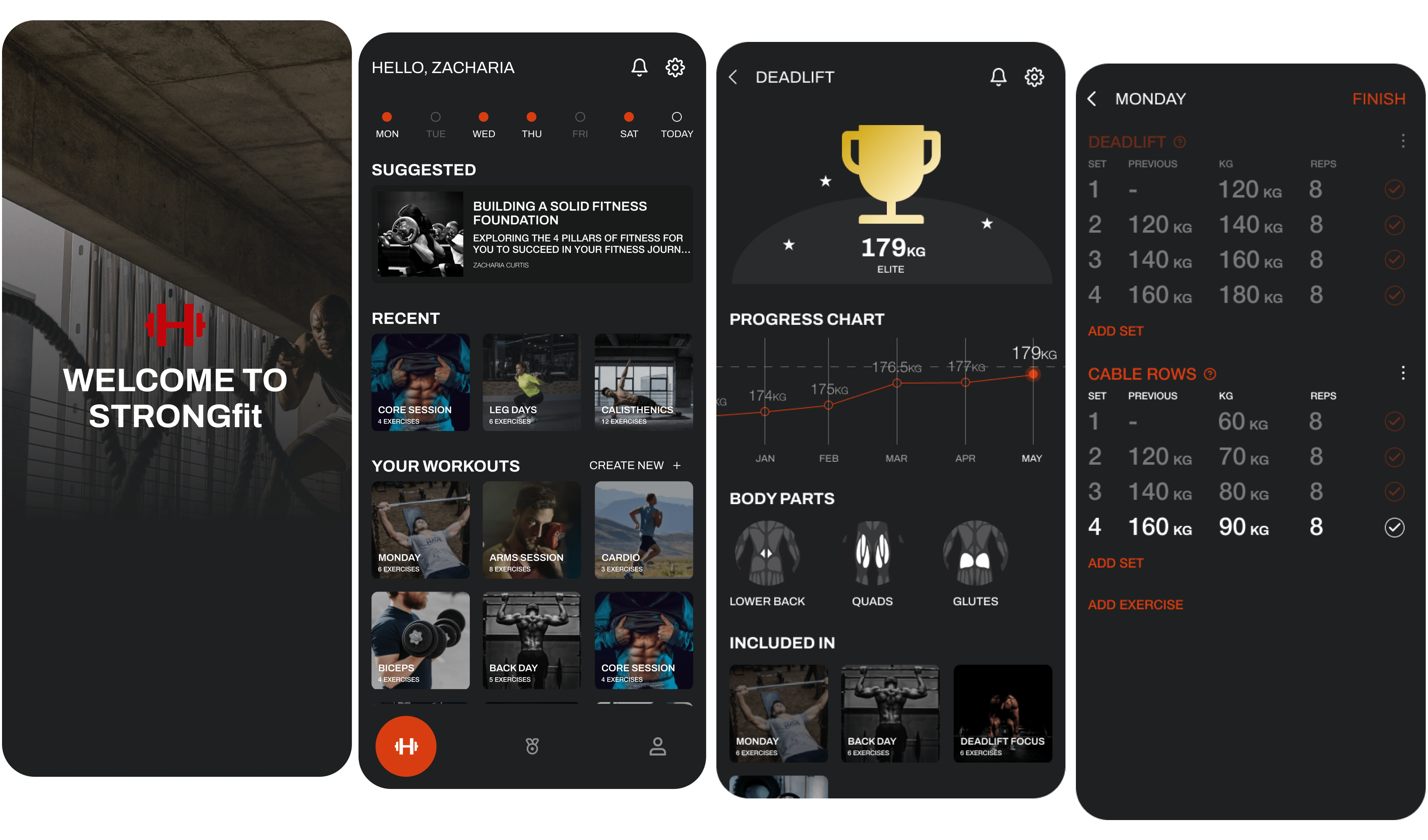
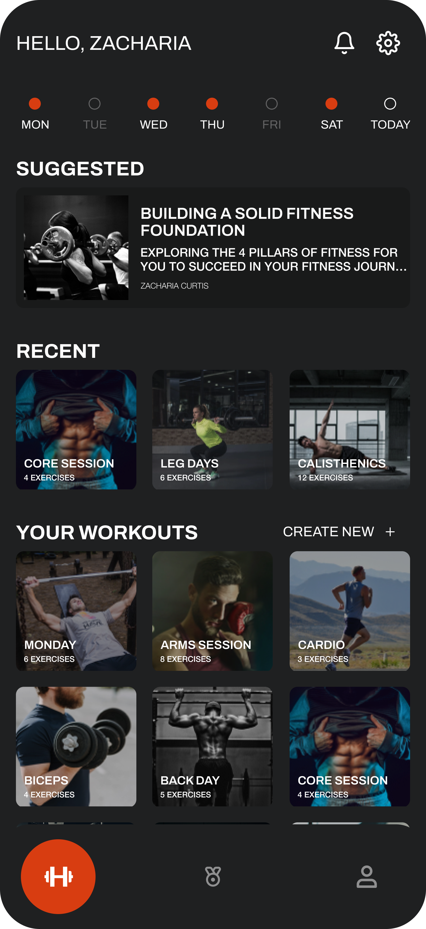
Several changes and improvements were made to the experience primarily to optimise core user flows

• The 'Today's Workout' section was removed due to lack of tailored content and replaced with an articles carousel to provide informative reading during rest periods. This also consolidated content categories to better align with platform focus.
• Visual consistency improved through standardised left-to-right text alignment.
• The 'Your Workouts' functionality was expanded & replaced several outdated journeys, aiming to utilise full screen real estate below the fold, reducing clicks. Recents formatting remained distinct given research indicating users scroll a limited number of recent workouts. This leveraged user tech literacy assuming a swipe function.
• Streamlined creation of new workouts.
• Navigation bar updated to reflect IA changes and order based on research into most used and desired platform areas.

Key outcomes for the changes included improved visual consistency, reduced clicks to task completion, tailored content, and simplified workout creation.

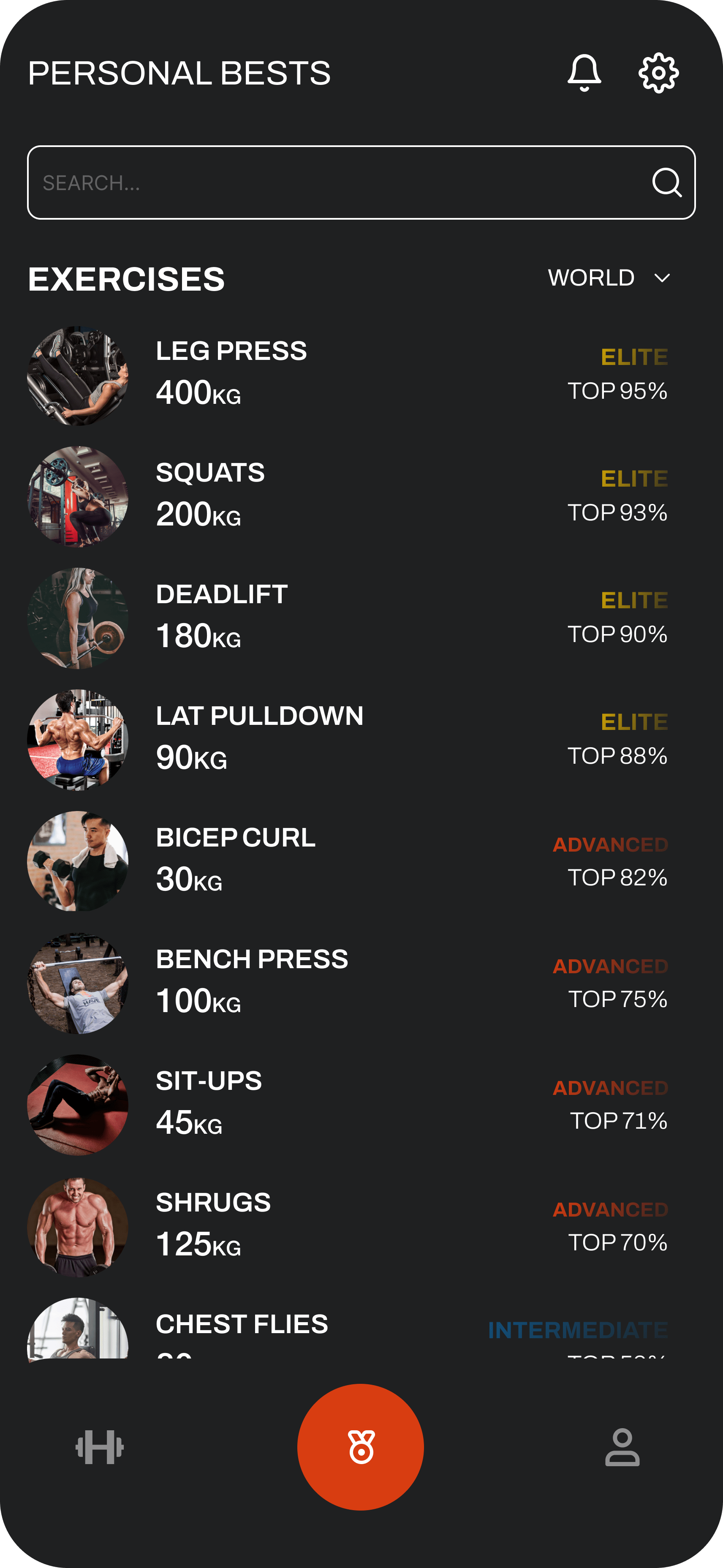
PERSONAL BESTS

Multiple enhancements were made to optimise the progress tracking user journey:

• The redundant 'Progress' tab was removed to consolidate and simplify flows.
• Personal bests were reorganised by strength level rather than alphabetically based on research showing users have consistent exercise regimens. This also better highlights users' top strength achievements.
• Rep ranges were replaced by 1 rep max displays at the top of the hierarchy to showcase progress and reinforcement.
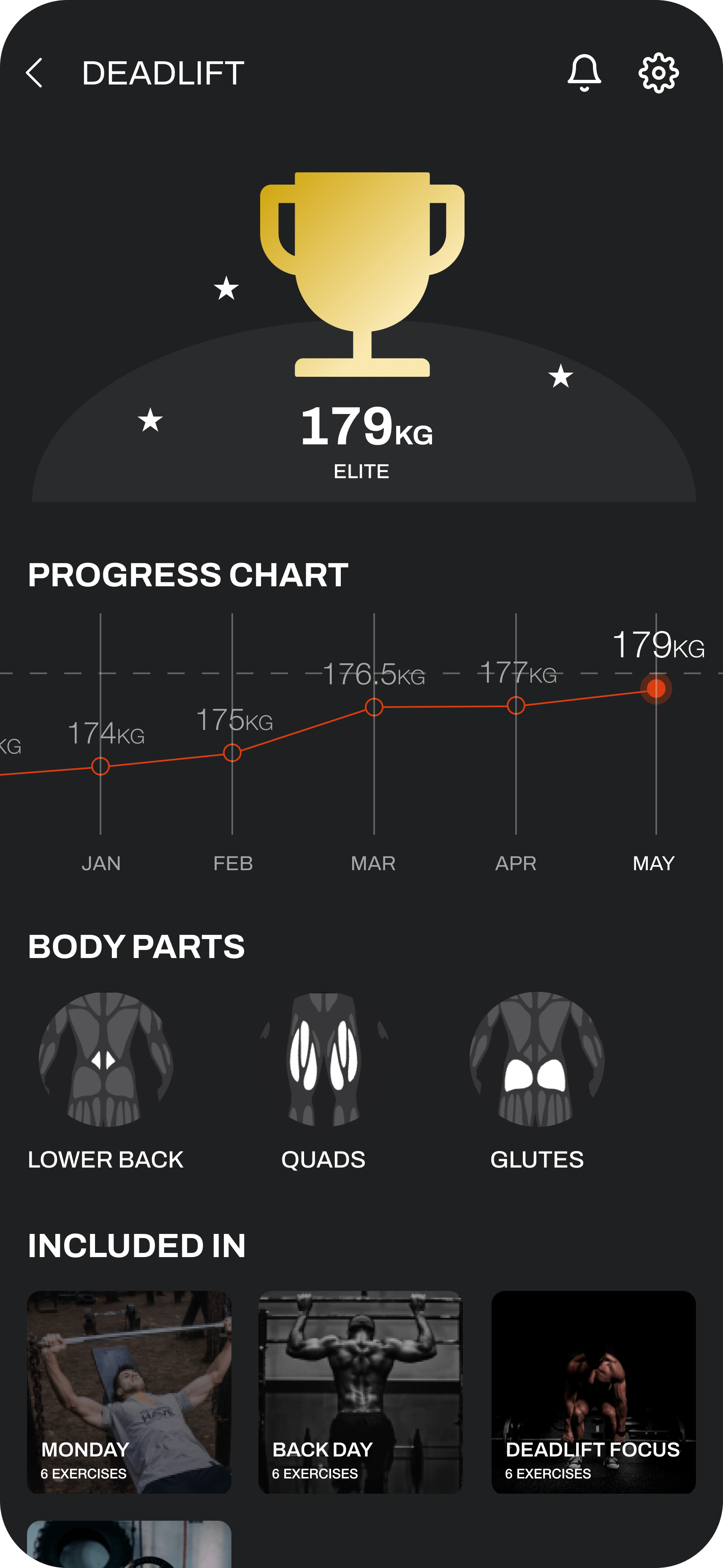
• The single exercise page was evolved to showcase achievements more prominently through visual design, providing cognitive rewards for progress made.

Optimisations were implemented based on usage data and user needs analysis. Outcomes include simplified navigation, achievement-focused information architecture, and enhanced cognitive rewards for progress - all aligning to core user goals.

Looking to the future it would be interesting to implement a deeper achievement design pattern, for example a linear title acquisition feature based on the users quality of achievements so far, enabling a deeper emotional investment into the platform

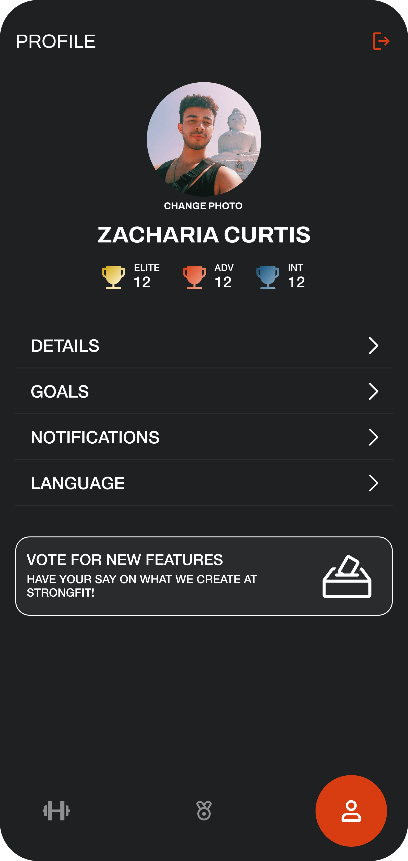
PROFILE

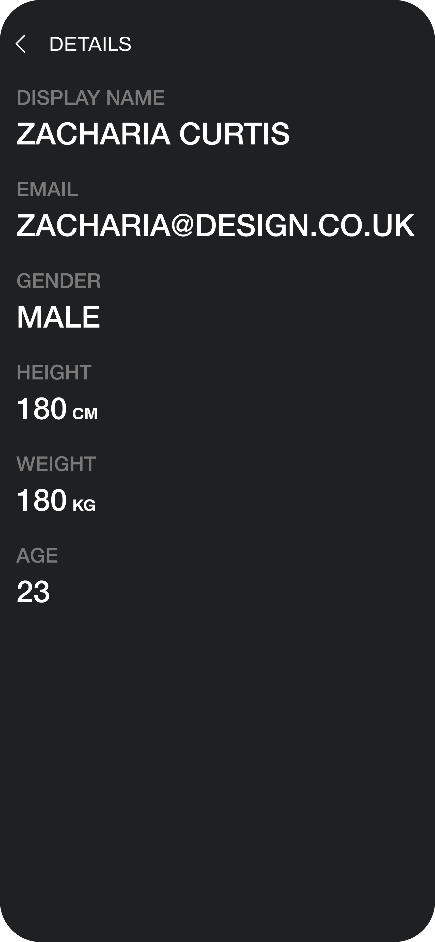
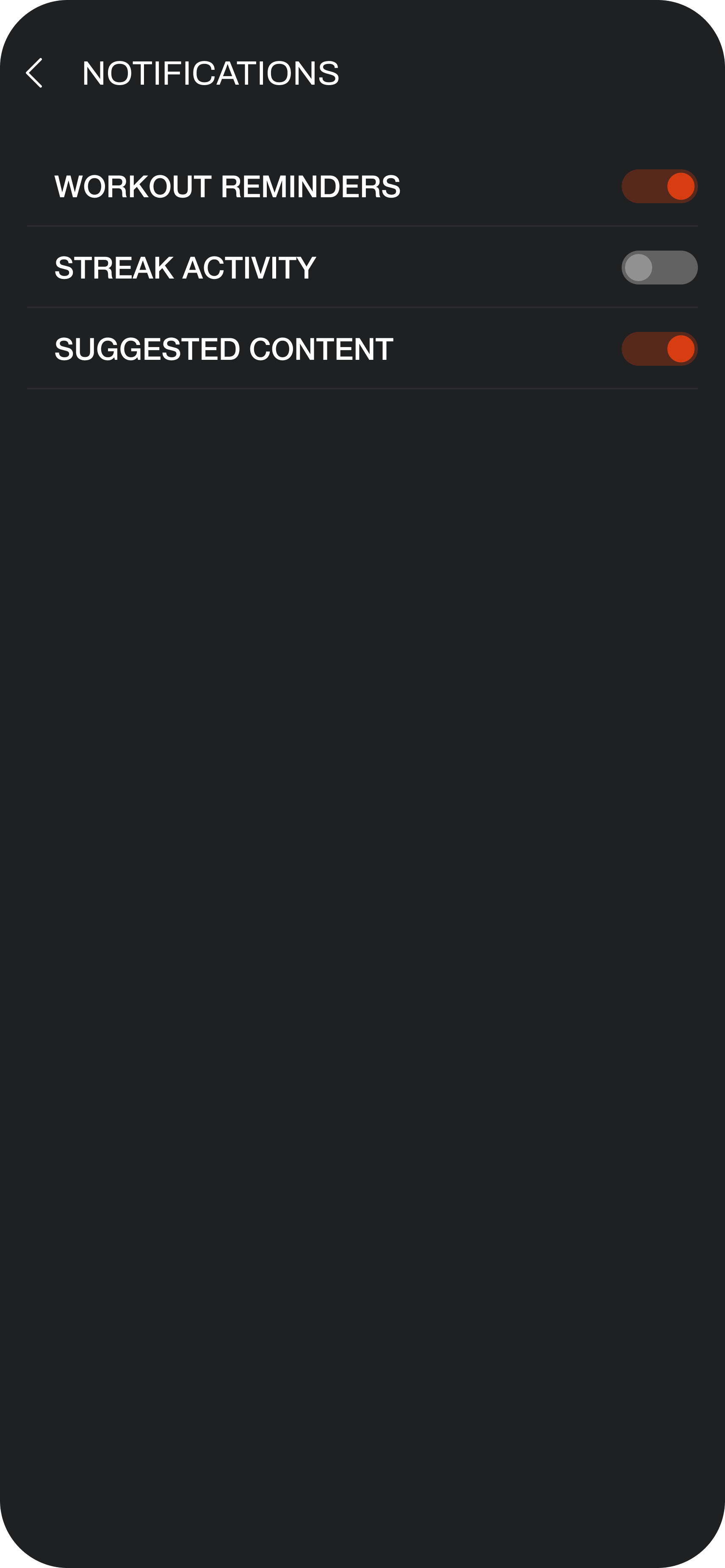
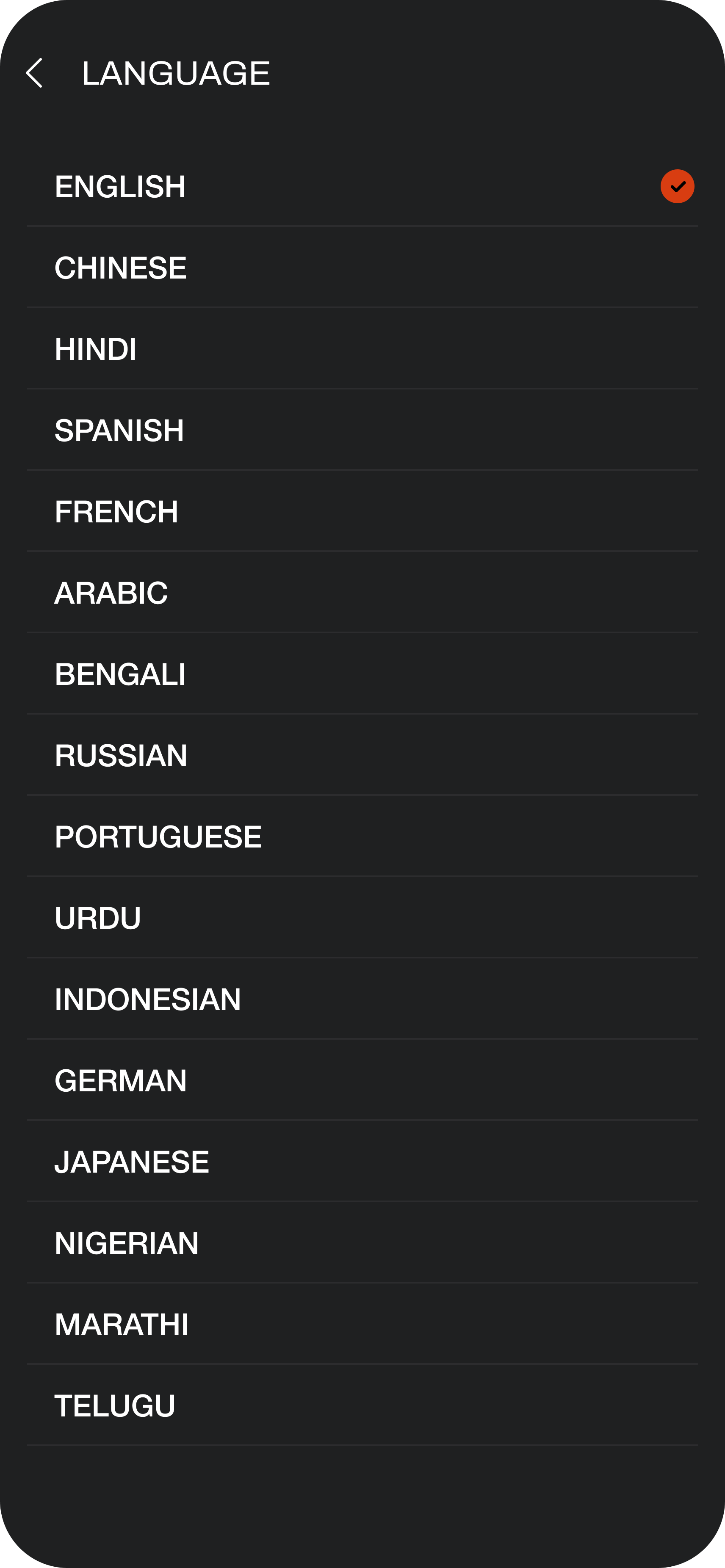
The profile section has been adapted to better fit the new visual experience, as well as a future section that would allow users to vote on preferred future features, enabling greater user driven platform growth

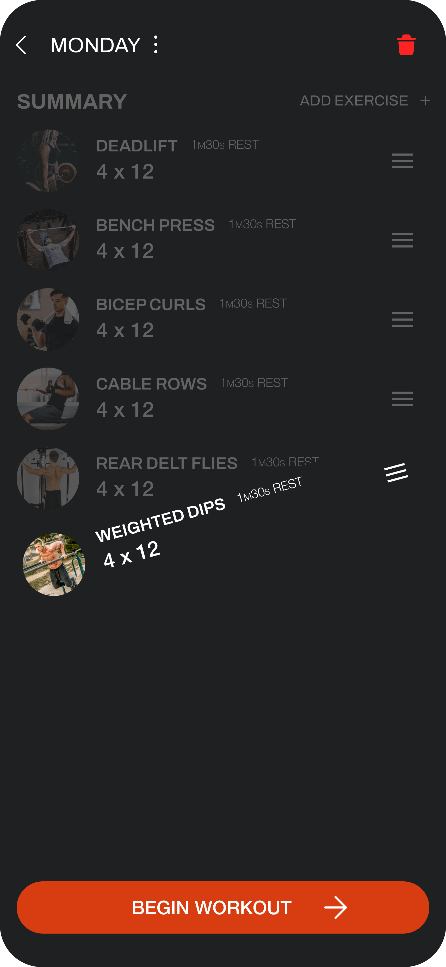
VIEWING WORKOUTS

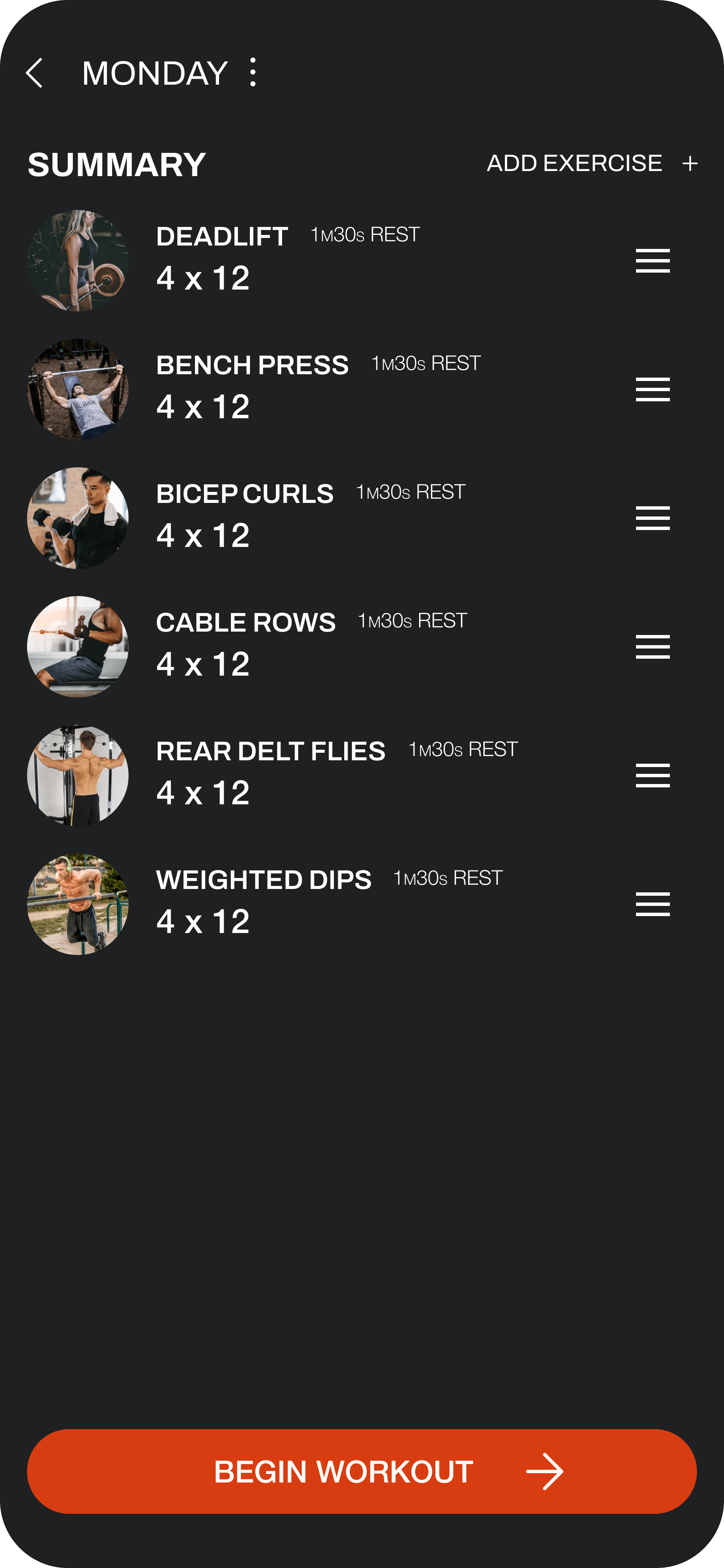
Changes made to workout creation and management flows were:

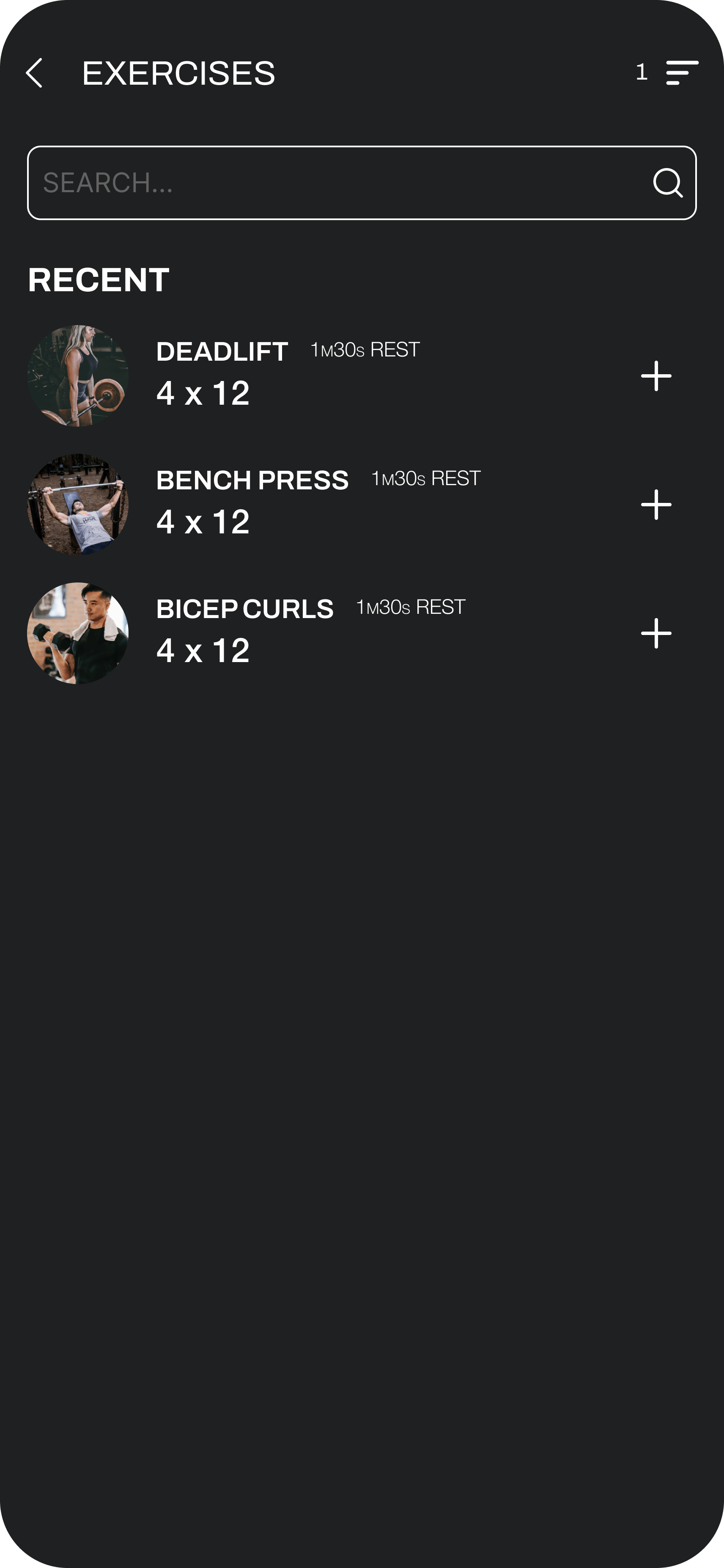
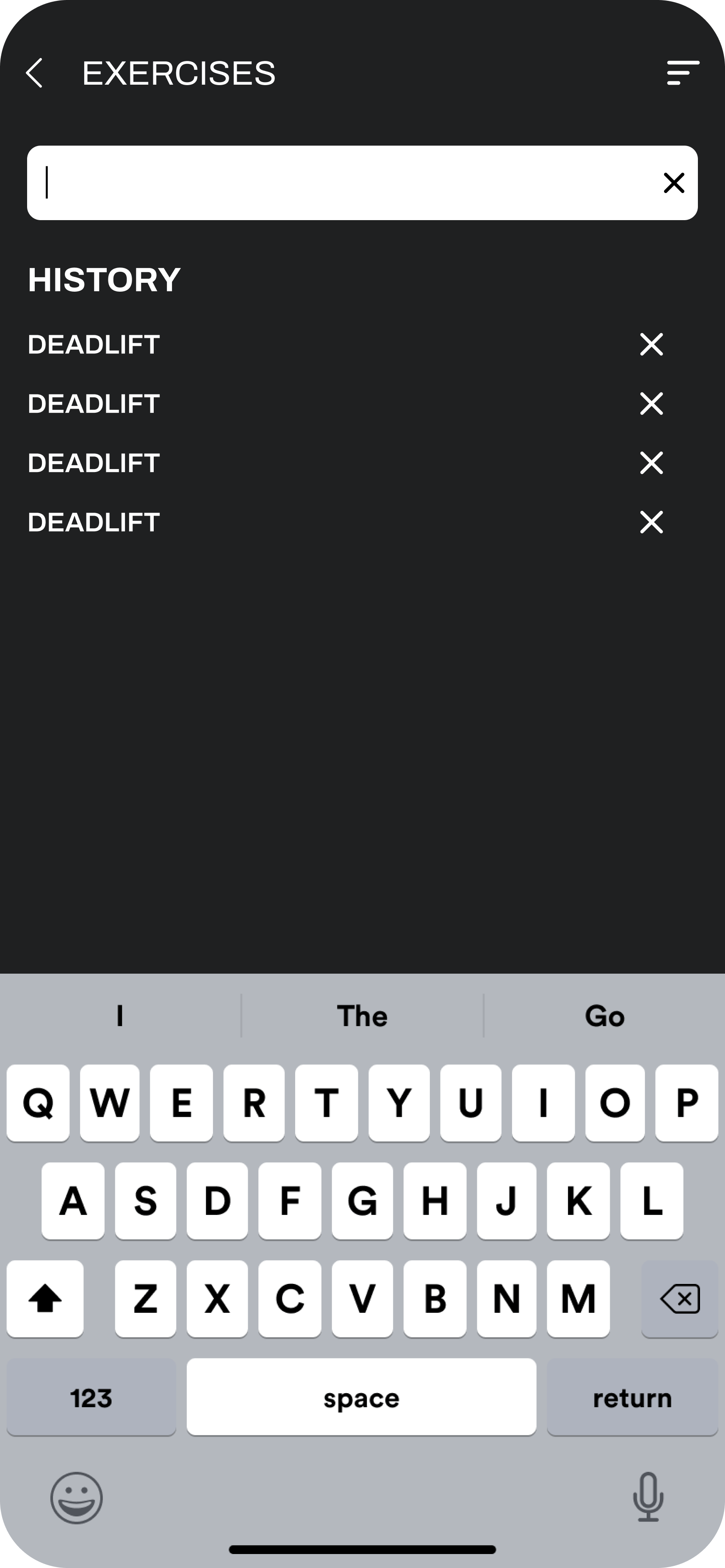
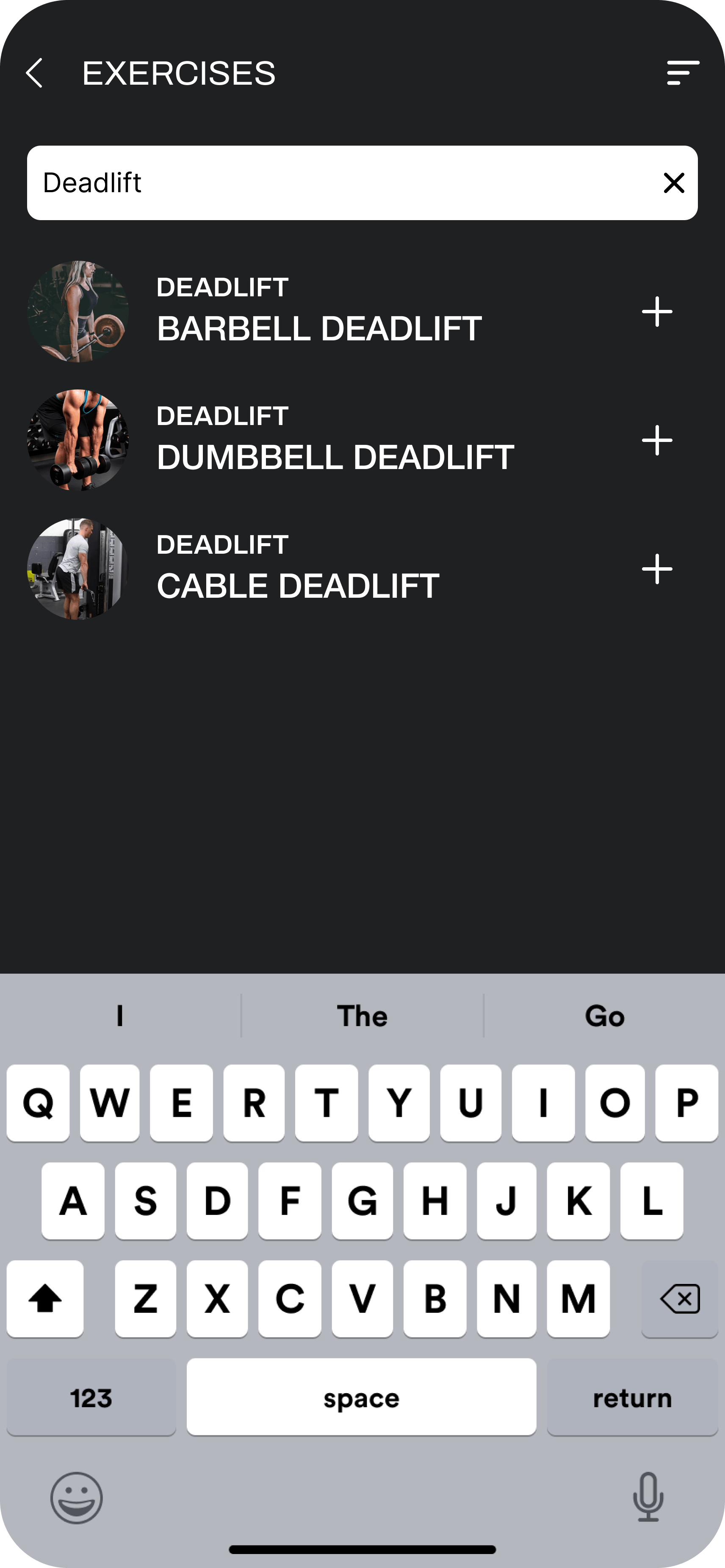
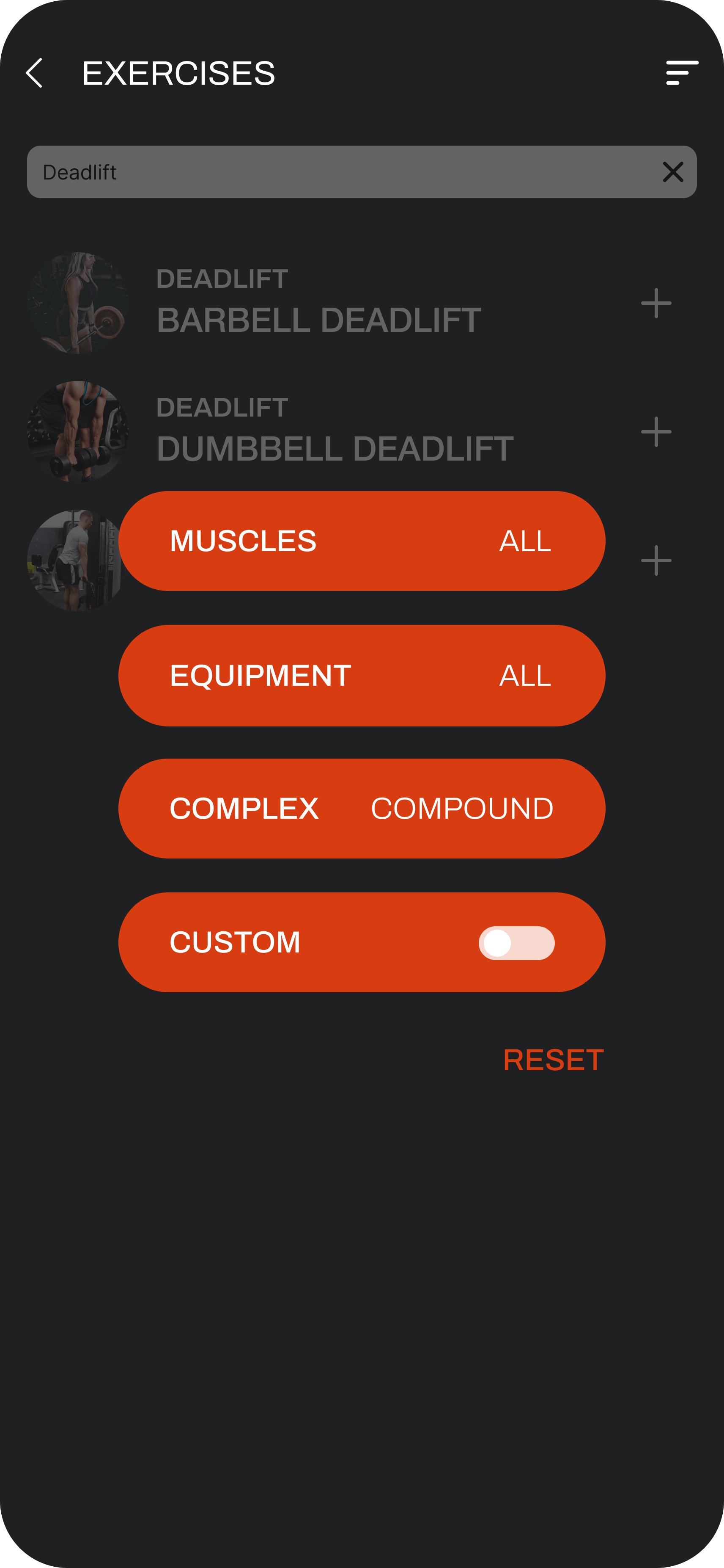
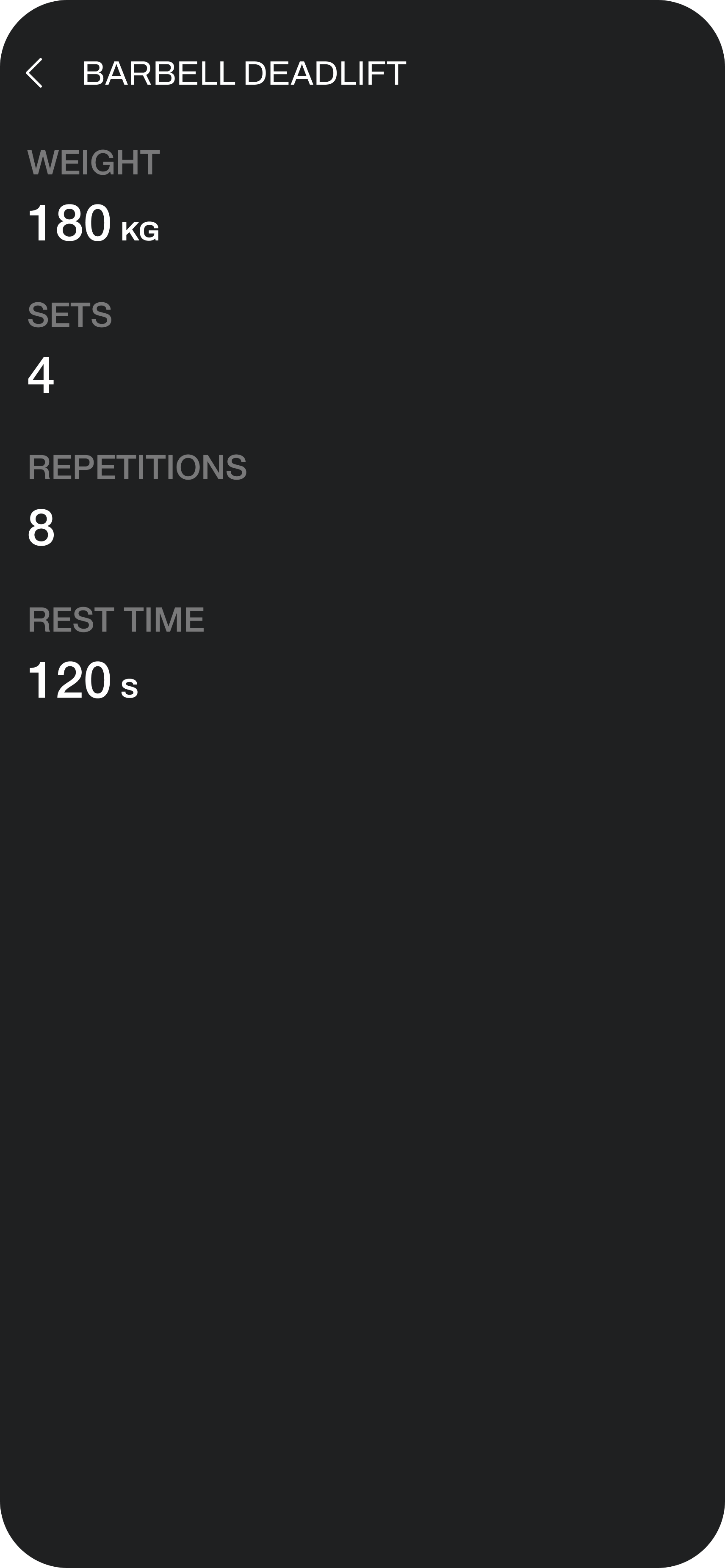
• The process for adding exercises to existing workouts was streamlined for simplicity.
• Workout editing was optimised by realigning reordering, deletion, and addition patterns with the broader platform.
• A new quick access menu was introduced for low-level changes like routine deletion, reducing clutter in the main navigation.

Targeted experience refinements were implemented to workout creation and management based on usage data and user feedback

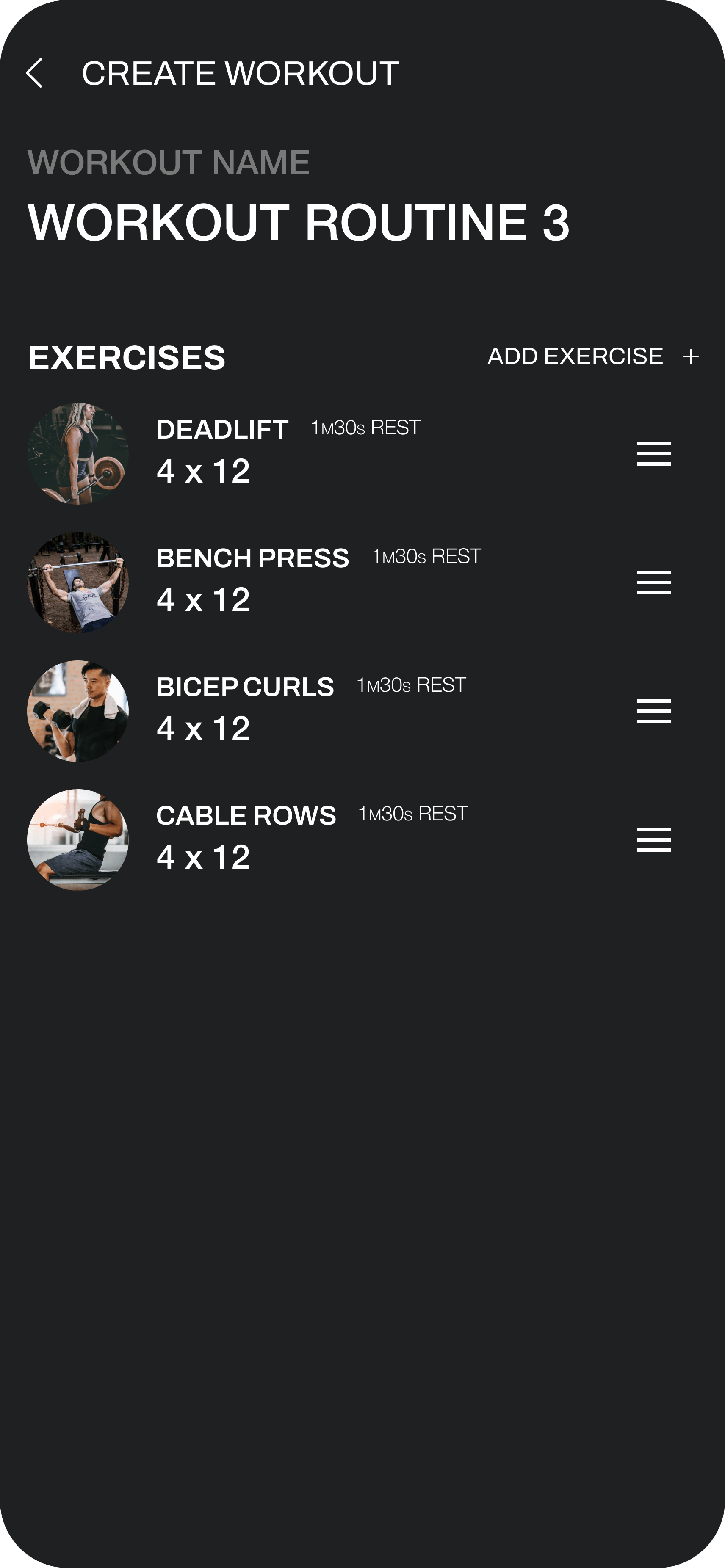
CREATING WORKOUTS

Improvements made to the onboarding flow included:

• The 'Cover' step was removed as it provided little value and sometimes caused confusion leading to drop-off.
• The visual experience was adapted to align with the broader platform aesthetic and leverage component reuse, optimising development efficiency.

WORKOUT ROUTINE

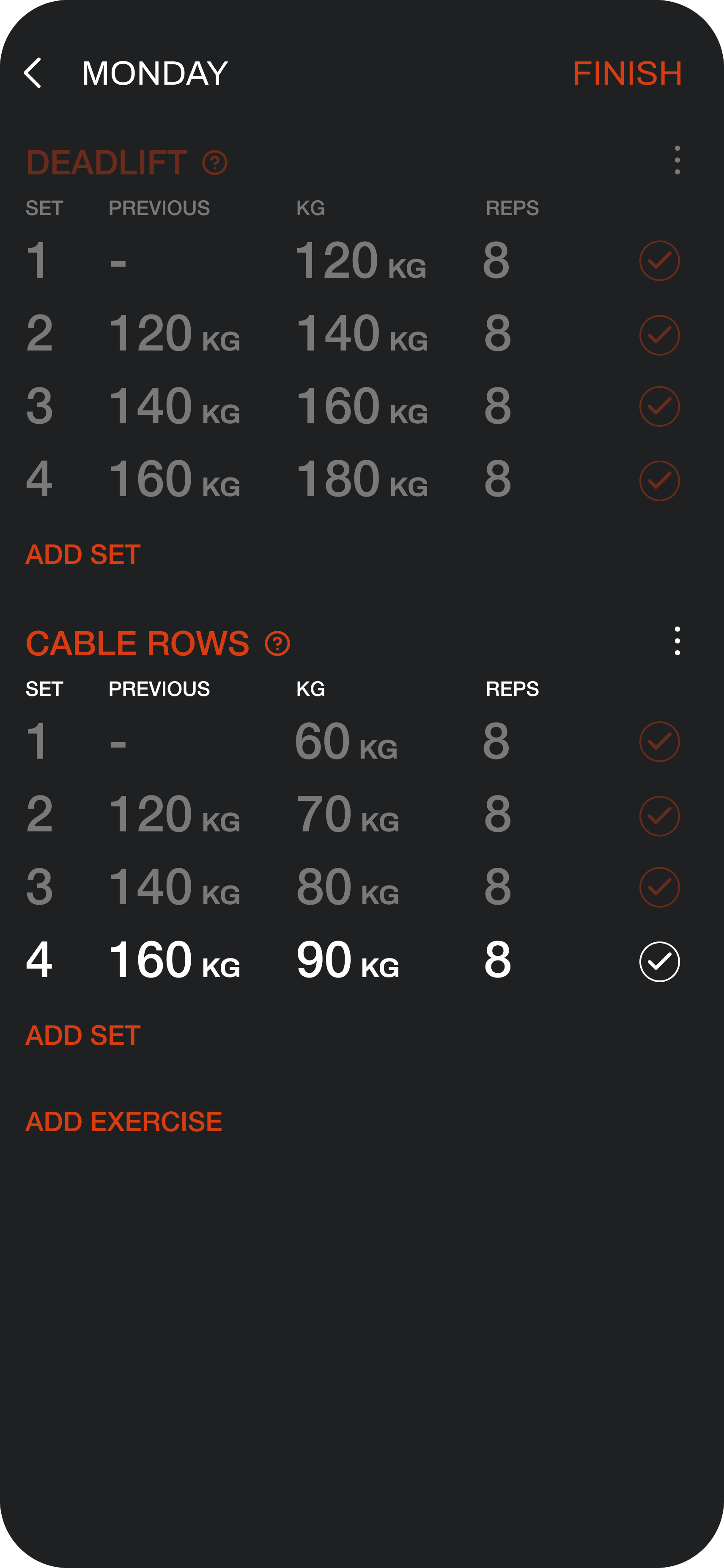
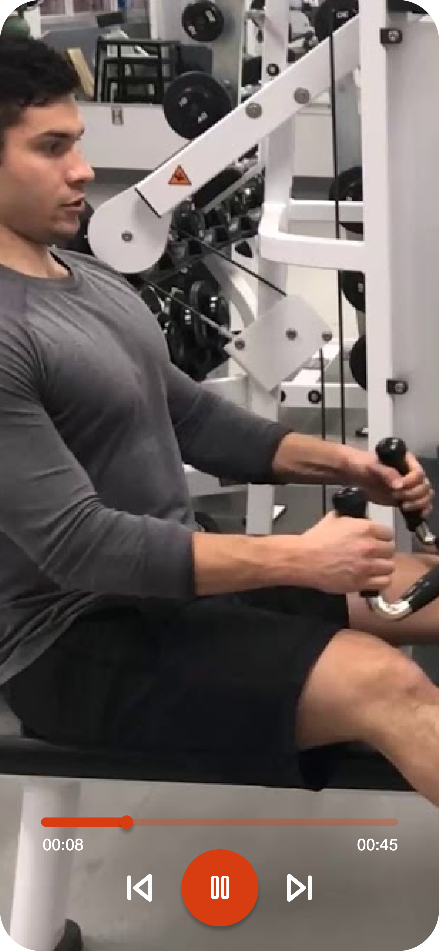
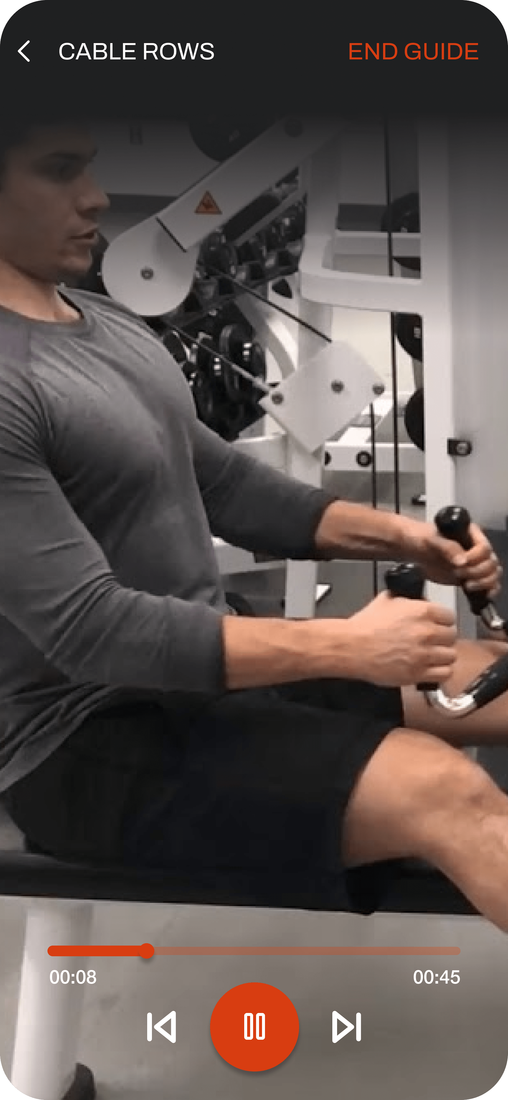
The in-workout experience underwent a complete redesign focused on clarity, accessibility, and usability:

• Enables full workout visibility without cognitive overload.
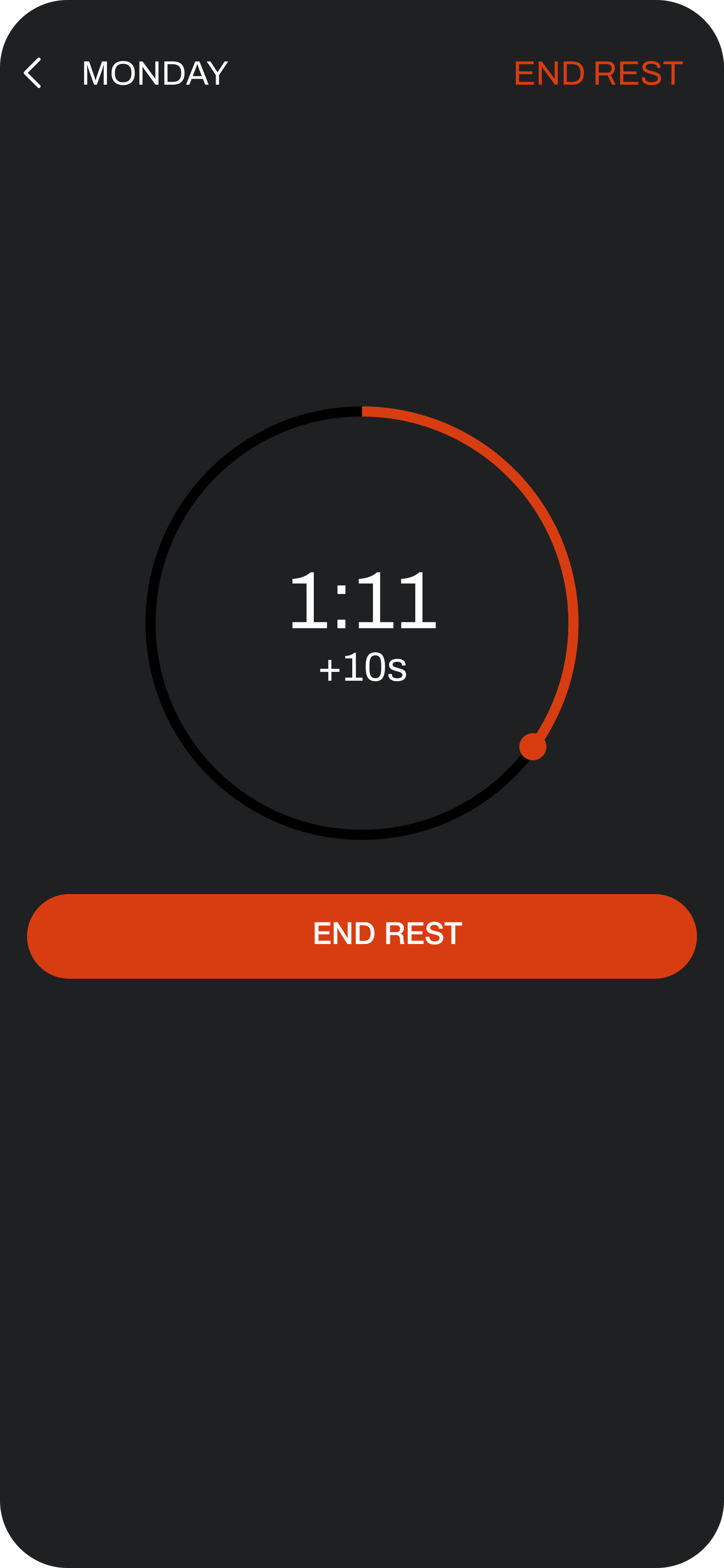
• In-app rest timer provides improved progress tracking without app switching.
• Error prevention adjustments like changing "Finish" to "End Rest" on the rest timer.
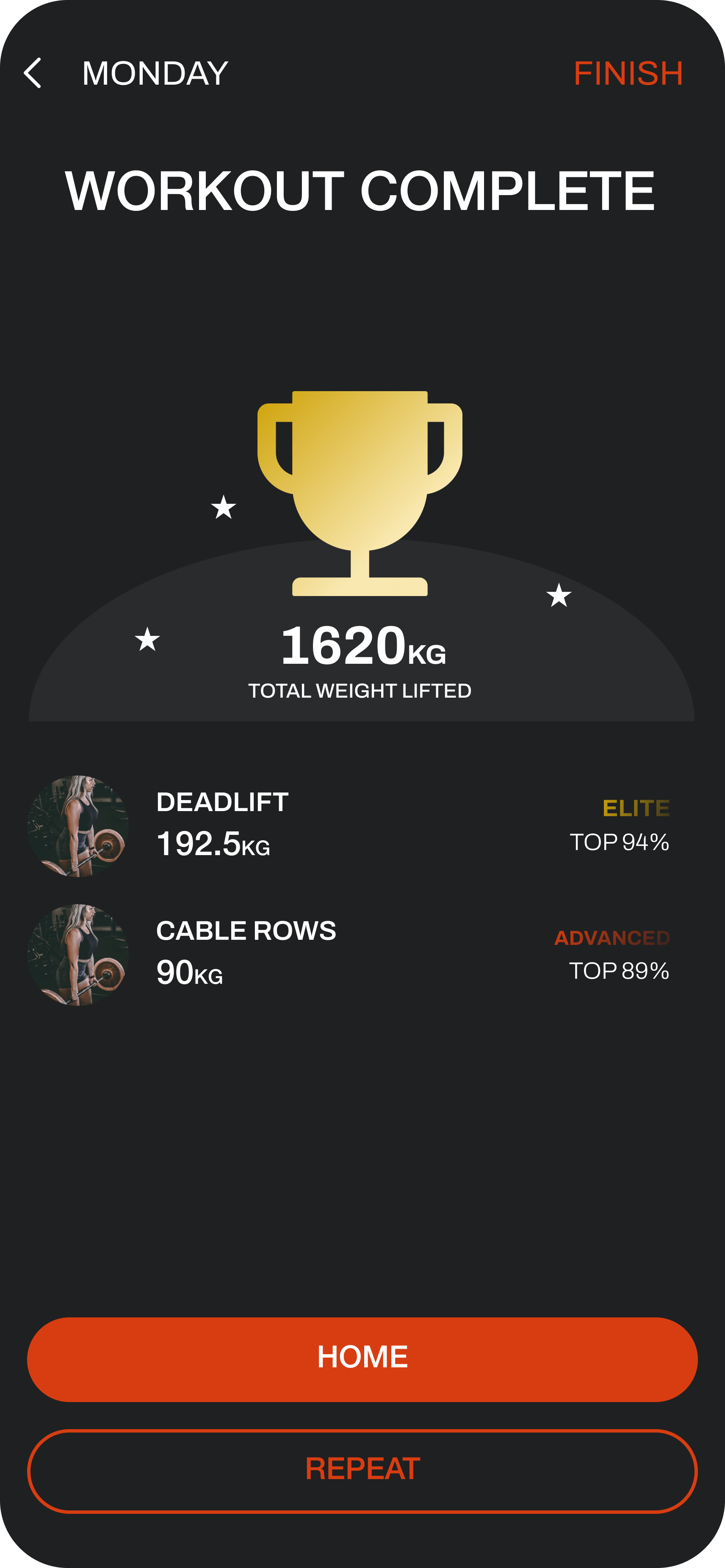
• Post-workout summaries added to drive a sense of achievement, including total weight lifted.

Outcomes included reduced cognitive load, simplified tracking, error proofing, and enhanced sense of progress - ultimately driving user engagement and satisfaction.

Looking forward adding some impactful interaction animations, particularly on workout completion could give users a greater delayed cognitive reward after each routine