REDEFINING WORKOUTS FOR BEGINNERS & ATHLETES ALIKE

Solving Real Friction: 62% of fitness enthusiasts weren't using apps; frustration, lack of clarity, or poor UX

Redesigning The Core: Crafted a seamless workout journey that combined planning, execution, and progress tracking

Alignment With Users: Customisation, progression, and clarity were the top three user priorities - We built around those pillars

Driving Measurable Value: Improved onboarding to 90%+ completion, and boosted intent-to-use by 43% through research-led design

Building For Engagement: Progression systems, personal best visualisation, and future achievement tiers to build motivating feedback loops.

Validating Through Data: Benchmarked against major competitors and drove 4× increase in perceived usefulness, ensuring business impact
STRONGfit had powerful tools: custom workouts, progress tracking, personal bests - but users weren't sticking around. Friction, confusion, and lack of feedback meant features went unused. With 60% of fitness enthusiasts avoiding apps due to poor UX, STRONGfit risked becoming another forgotten download.

"I don't want to figure it out. I want to start working out." - User Interview excerpt
STRONGfit had the chance to transform scattered workout tools into one seamless, motivating experience.
VALIDATING ASSUMPTIONS AND UNCOVERING REAL USER NEEDS TO SHAPE A PRODUCT THAT FITS HOW PEOPLE TRAIN
Studying leading fitness apps helped us avoid common pitfalls and uncover clear areas of opportunity. We analysed four key competitors to understand where they excelled, where users felt blocked, and how STRONGfit could offer a better, more motivating experience. This helped us design not just for feature parity, but for a smoother, more flexible user journey
What it gets right:
Where it falls short:
STRONGfit's Learnings:
Build momentum through visual progression and mid-session flexibility
What it gets right:
Where it falls short:
STRONGfit's Learnings:
Offer deep personalisation without locking core value NO paywalls for essential workout features to build trust before monetisation
What it gets right:
Where it falls short:
STRONGfit's Learnings:
Prioritise user emotion, not just performance stats, through visual achievements and cognitive reward structures
What it gets right:
Where it falls short:
STRONGfit's Learnings:
Target gym-focused strength training users with transparent routines, goal tracking, and less restrictive content access

Most competitors suffer from freemium frustration, locking value too early
Very few allow users to edit routines mid-session
Progress tracking is often data-rich, but emotionally flat
By combining visual feedback, mid-workout control, and lightweight onboarding, STRONGfit positioned itself as a more flexible, emotionally engaging, and value-accessible alternative to all four competitors
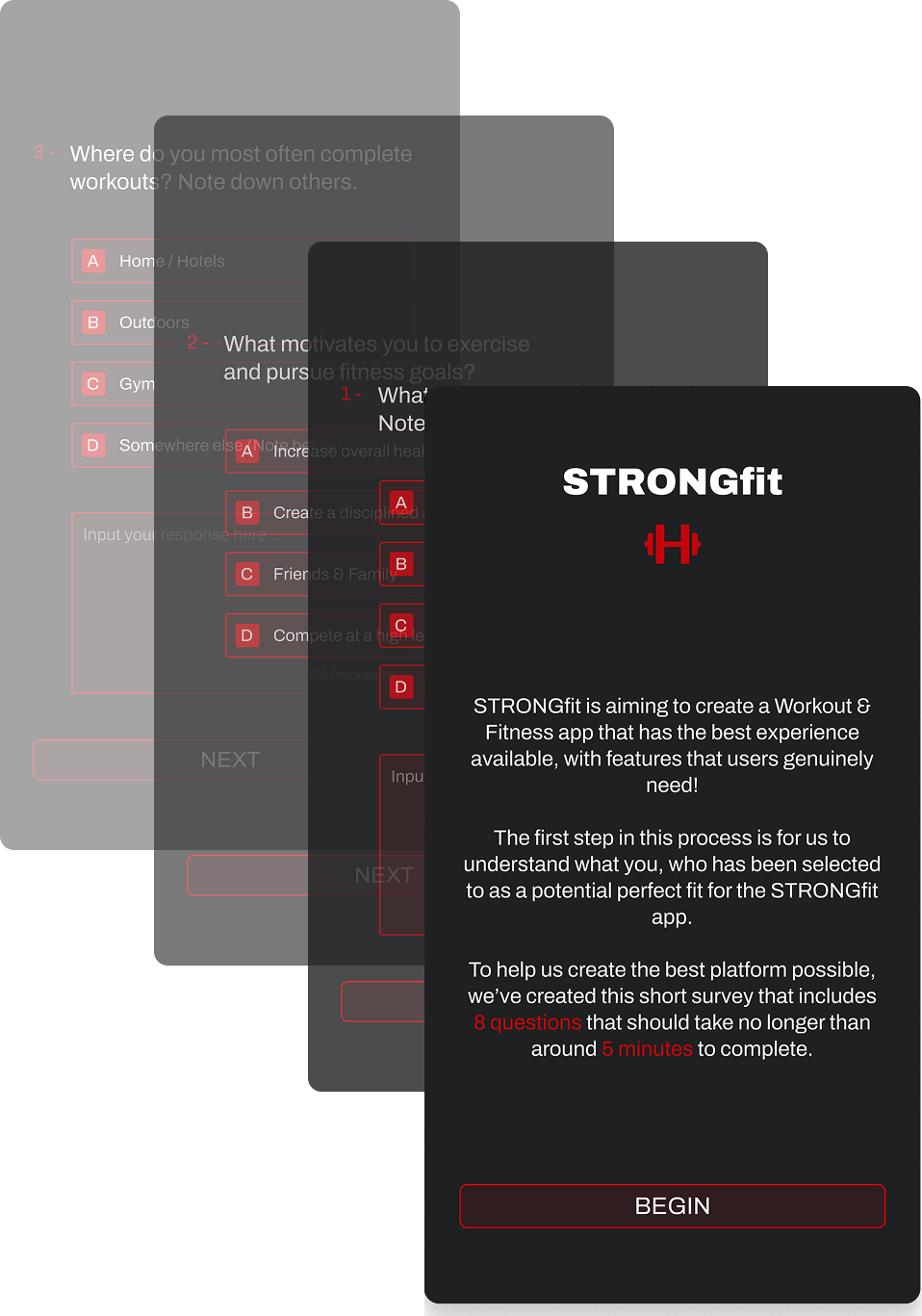
To bridge the gap between assumptions and real-world needs, we gathered early mock-ups and surveyed a targeted group of users who matched our core personas.
This selection of surveys were designed to capture a blend of behavioural, attitudinal, and UX feedback.
Strong baseline usability: Users found the core interface intuitive, but suggested improvements in navigation hierarchy and screen-to-screen flow.
Desire for personalised content: Users wanted the app to adapt over time based on their habits and goals.
Achievement visibility mattered: The ability to track personal bests and view strength progression in a single, clear space increased perceived value.
Flexibility was non-negotiable: Users loved being able to modify routines mid-session and design their own workouts, even within structured plans.
These findings directly shaped several redesign decisions, especially the improved workout editor, progress visualisation, and home screen content logic.
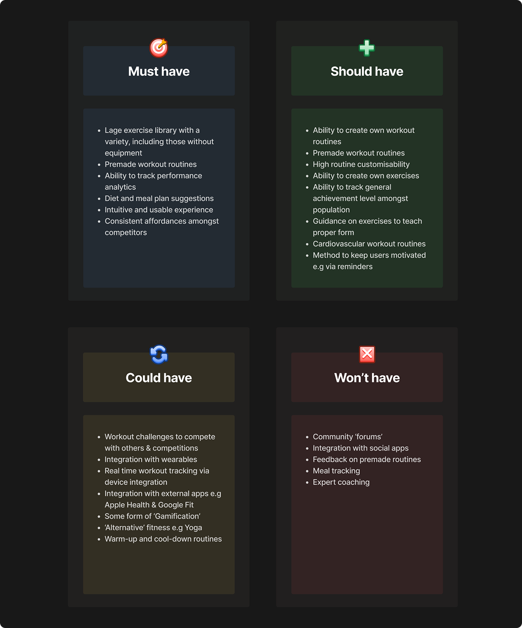
To ensure research translated into real decisions, we used the MoSCoW method to categorise and align roadmap features based on user demand, business value, and feasibility
CREATING CLARITY, MOMENTUM, AND MOTIVATION TO EVERY STEP OF THE FITNESS JOURNEY
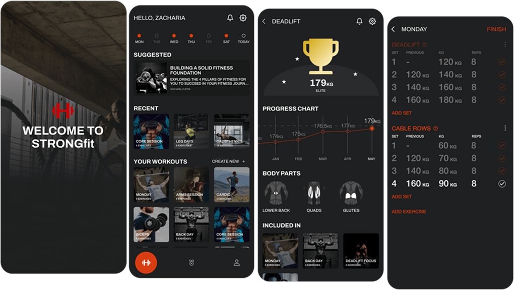
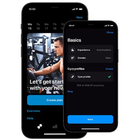
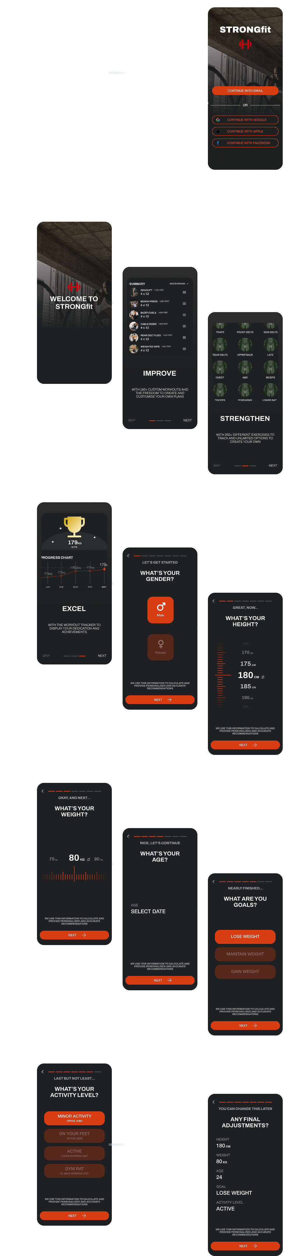
Navigating the original onboarding flow caused confusion and early drop-off. Misaligned step order, unclear metric toggles, and generic value propositions led to a weak first impression and inconsistent completion rates.
We rebuilt onboarding to match user expectations and reinforce the app's value from the first interaction. By focusing on clarity, tone, and purposeful flow design, we raised completion rates above 90%.
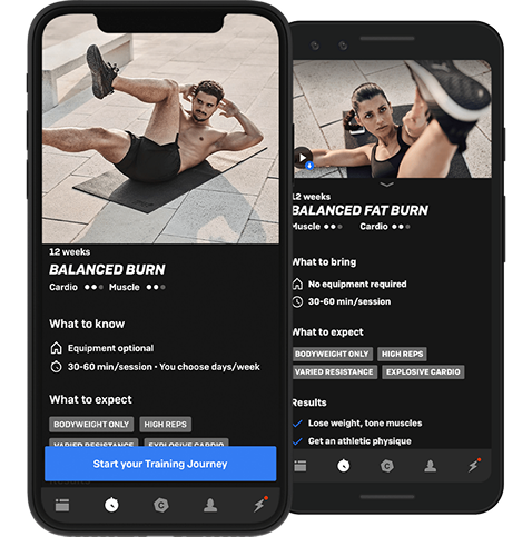
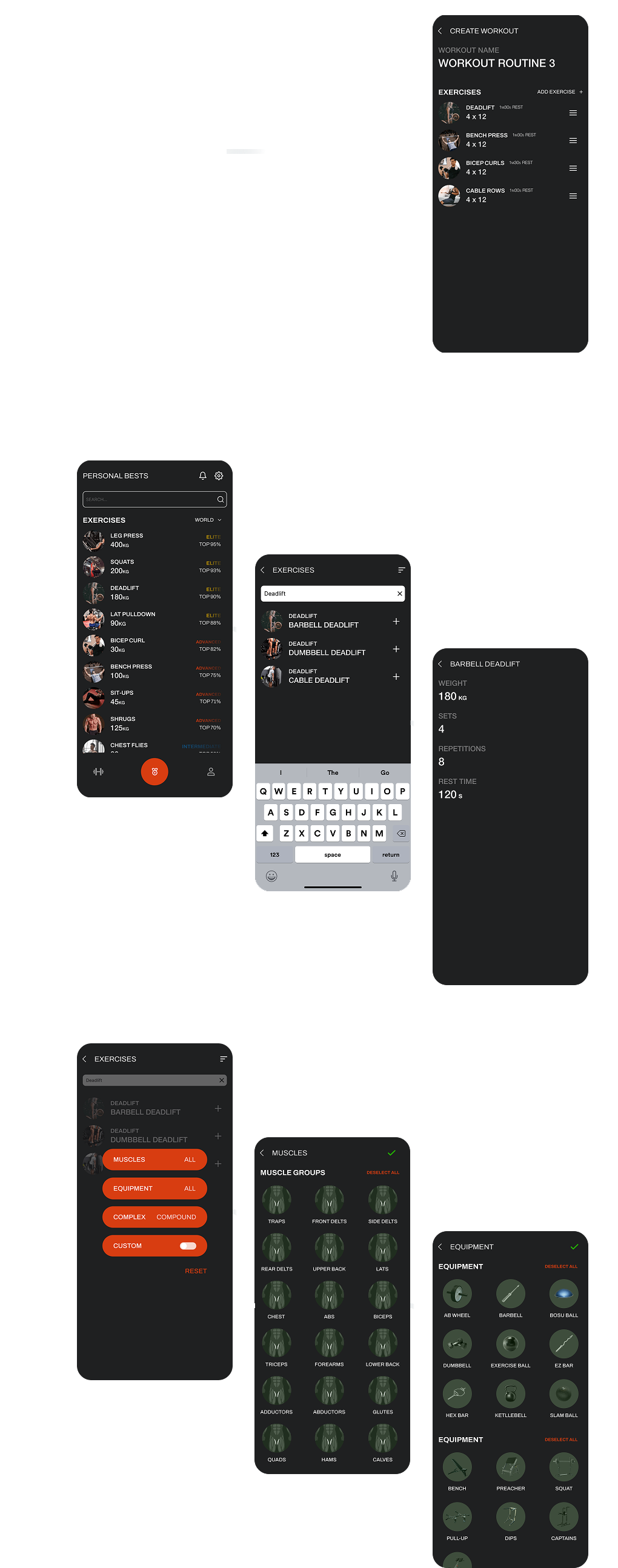
Legacy workout creation was bloated and unclear—users often dropped off mid-setup or struggled to find specific exercises. Confusing filters, unnecessary cover screens, and inconsistent interaction patterns disrupted momentum.
We restructured the flow around searchability, speed, and optional depth—allowing any user to go from idea to ready-to-train in minutes.
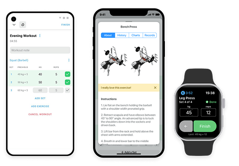
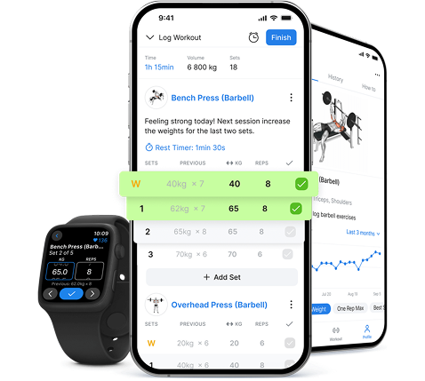
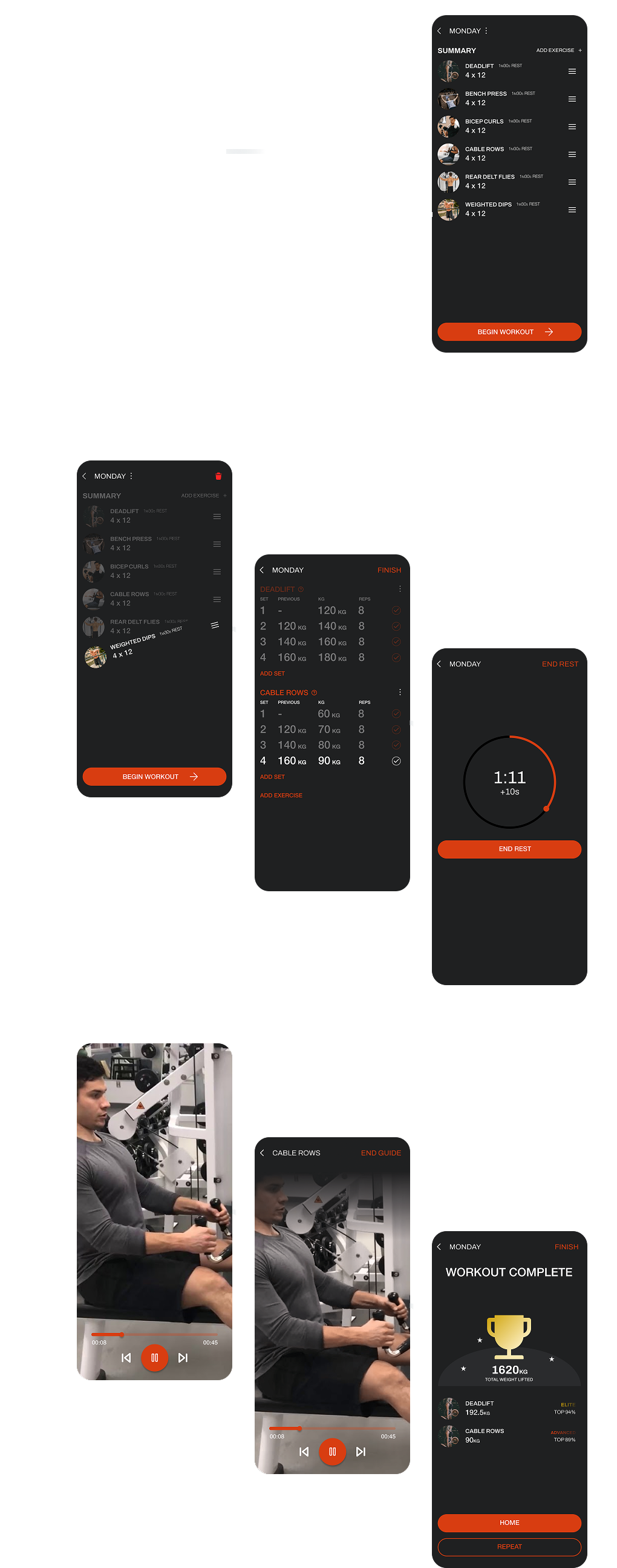
The original in-workout experience lacked adaptability. Users couldn't reorder exercises, adjust mid-session, or view their full routine at a glance. Rest timers required switching apps, and the session often ended with no feedback or reward.
We redesigned this experience to reduce friction and build flow—giving users agency in their sessions and reinforcing progress after every workout.
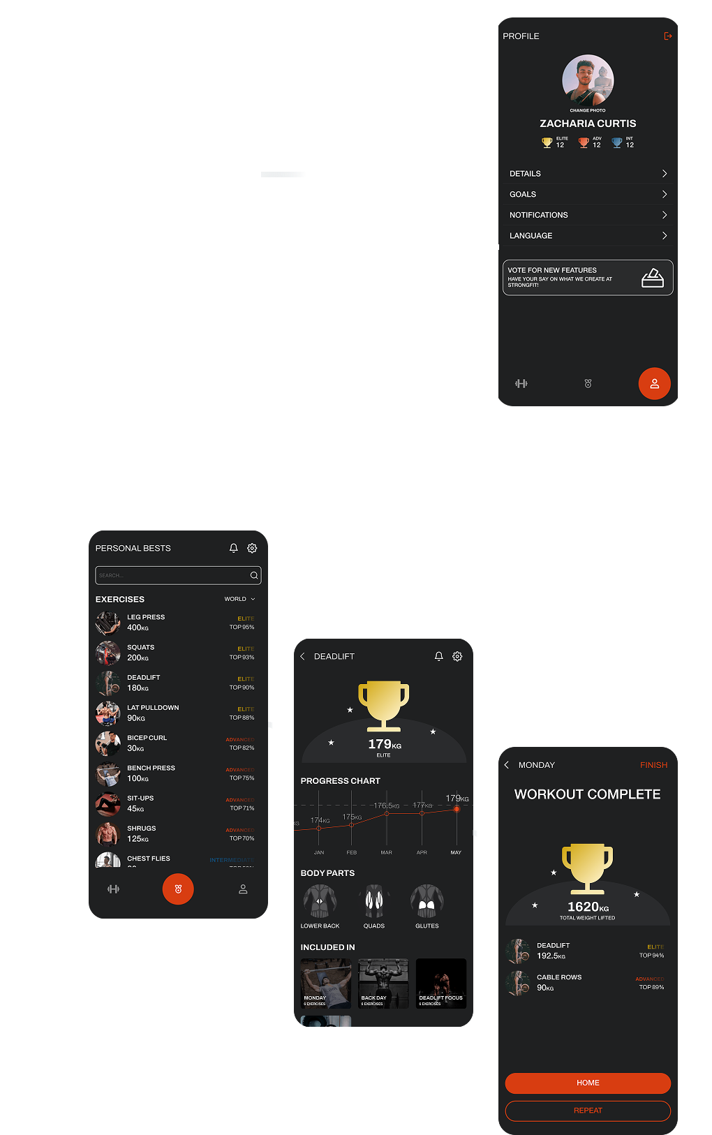
Progress tracking in the legacy app was fragmented and uninspiring. Separate PB and Progress tabs created confusion. Users saw numbers, but rarely felt momentum or success.
We rebuilt the system into a singular, motivational view - organised by strength level and visually designed to make users feel proud, not overwhelmed.
The redesign of STRONGfit was more than visual refinement, it was a strategic overhaul that transformed feature fragmentation into a cohesive, user-driven experience.
Our research surfaced clear priorities. Users wanted customisation, flexibility, and visible progress; they didn't want to learn a system before using it.
Every design decision responded directly to this feedback and was validated through iterative testing.
The STRONGfit experience now reflects what the original platform missed. It is faster to use, easier to trust, and structured around how users actually train.